In December I said that testing your call to action should be at the top of your New Year’s resolution list.
On the Internet the call to action often takes the form of a button. So while words still matter, there are other dimensions to consider.
Thinking about the size, shape, color, and placement (among other characteristics), our findings indicate that future testing could reveal surprising – and positive findings – based on changes to the download button.
That’s an excerpt from a post (The Download Button Drives Downloads) on the Mozilla Blog of Metrics. By the way, they’re absolutely right.
Call To Action Button Size
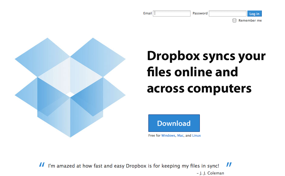
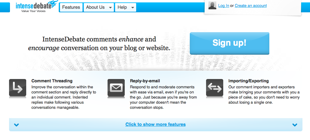
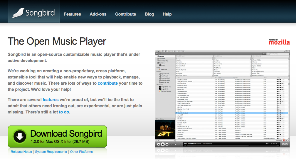
Your call to action buttons should be big and obvious. If you abide by Five Foot Web Design principles you should have no problem seeing the call to action when you take a few steps back from your monitor. If you can’t see it, your users are likely to miss it as well.
Here are a few examples of sites who got it right.
Dropbox
Intense Debate
Songbird
WordPress
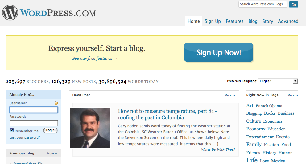
Size can be relative based on the placement of the button and other design elements on the page. Your call to action button doesn’t always have to be huge but … you’re probably better off with it being bigger rather than smaller. (No jokes here please.)
Don’t be afraid to make your offer! Be confident. Not doing so is a subliminal sign to users that the product or offer isn’t valuable.
Call To Action Button Colors
Size is a relatively easy subject to tackle. The color of call to action buttons, on the other hand, is a hot topic. Jonathan Mendez (who you should be reading) touts the use of red in his 7 Rules for Landing Page Optimization.
Tell your brand team to go to hell and throw your styleguide out the window. Red buttons can by themselves raise your conversion rate. Green can be good as well but most times in our testing if color matters it is red that wins.
Not everyone agrees that red is the answer. And clearly none of the examples above took this advice to heart. Yet three out of four (Songbird being the outlier) have buttons that adhere to the site’s current styleguide and color palette. So who’s to say red wouldn’t provide a boost in conversion rate.
Why is color such a big deal?
Research reveals all human beings make a subconscious judgment about a person, environment, or item within 90 seconds of initial viewing and that between 62% and 90% of that assessment is based on color alone. [Institute for Color Research]
Each color is associated with different emotions and meanings. The ‘red’ debate revolves around whether the benefits of the color – passion, desire, excitement – outweigh the drawbacks – anger, danger and debt.
Red should be used sparingly, so as not to overwhelm users, and should also be first on your list of colors to test on your call to action button.
Lets face it. The speed of our society has accelerated and time is perhaps our most guarded resource. A site has a very short window to capture, retain and direct a user. So red doesn’t sound like a bad idea. In fact, any contrasting color might do the trick.
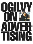
Less talked about is the color of the text on the call to action button.
David Ogilvy, often called the Father of Advertising, made black text famous in his book Ogilvy on Advertising. (Yes, the man practiced what he preached.)
Yet the overwhelming number of call to action buttons use white text on a colored background. Ogilvy would certainly have thrown a fit if he saw white text on black.
Three out of the four examples above (Songbird being the outlier again) use reversed out text. Is that a lost opportunity?
Don’t forget to try a black text version when testing your call to action button.
You’ve got nothing to lose and everything to gain by testing the words, size and color of your call to action buttons. It is one of the easiest things you can do to improve your business.
The Next Post: 9 Reasons You Should Have Been at SMX West
The Previous Post: Product (Re)Placement

2 trackbacks/pingbacks
Comments About Call To Action Button Size and Color
// 1 comments so far.
TraiaN // June 15th 2009
This is a nice informative post. However, I would recommend signing the articles or have the author name some place on this page.
Although not directly related to design, I have wrote a post about a technique called dynamic text on call to action buttons , which some of your blog readers may find it useful. Cheers.
Sorry, comments for this entry are closed at this time.
You can follow any responses to this entry via its RSS comments feed.