You Are Browsing The Analytics Category

Reclaiming Lost iOS Search Traffic

December 19 2012 // Analytics + SEO // 29 Comments

Have you noticed that direct traffic year over year is through the roof? Maybe you scratched your head, wrinkled your brow and chalked it up to better brand recognition. In reality, no such thing happened. What is happening is search traffic from iOS is being attributed to direct traffic instead.

Your organic search numbers are being mugged.

[Update] Frank Zimper notes that this problem also exists for those running Android 4.0 and higher. I’ve confirmed this via the same process you’ll read below. The only saving grace is that Android is usually a smaller traffic driver and the version migration is far more gradual. Yet, it’ll clearly continue to syphon search traffic off over time unless Google addresses this problem.

iOS 6 Search Theft

Stolen Search Traffic LOLcat

The reason these visits are being mis-attributed is a decision by Apple to move Safari search to secure (SSL) in iOS 6. The result of this decision is that the referrer isn’t passed. In the absence of a referrer Google Analytics defaults those visits to (none) which shows up in direct traffic.

The web browser on iOS 6 switched to use SSL by default and our web servers don’t yet take that fact into account. Searching still works fine, but in some situations the HTTP referer header isn’t passed on to the destination page. We’re investigating different options to address this issue.

As Google investigates different options to address this we’re left dealing with a serious data problem. Personally, I think Google Analytics should have a message within the interface that warns people of this issue until it’s fixed.

RKG did a nice job of tracking this and showing how to estimate the hidden search traffic. But for some reason this issue doesn’t seem to be getting as much traction as it should so I wanted to demonstrate the problem and show exactly how you can fight back. Because it’s tough enough being an SEO.
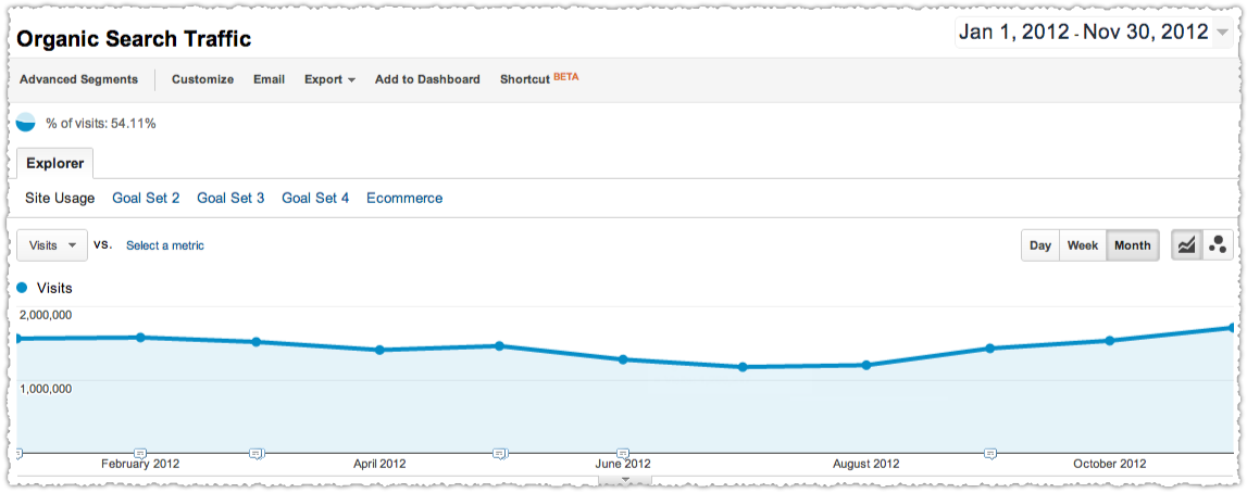
Organic Search Traffic Graph 2012

At a glance it looks like this has been a decent year for this client. But it’s actually better than it looks in October and November. Follow along to see just how much better.

Create iOS Advanced Segments

The first step is to create two Advanced Segments, one for iOS and one for iOS 6.
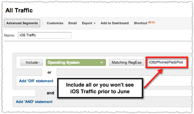
iOS Advanced Segment in Google Analytics

In May the labeling of Apple Operating Systems changed from specific devices to iOS. So include all four so you can see your iOS traffic for the entire year.
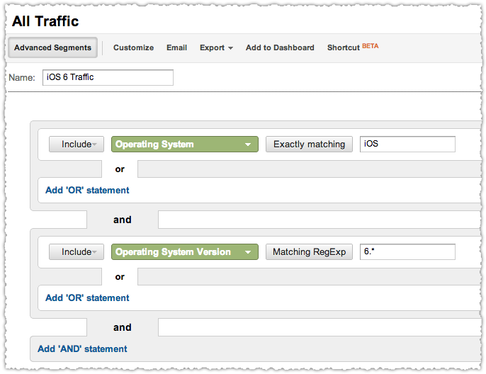
iOS 6 Advanced Segment in Google Analytics

The iOS 6 segment is straightforward and will only be used to demonstrate and prove the problem. Also, if you want to perform this analysis on multiple analytics properties be sure to save these segments to any profile.

The Scene Of The Crime

Once you have your advanced segments you want to apply them as you look at direct traffic by month.
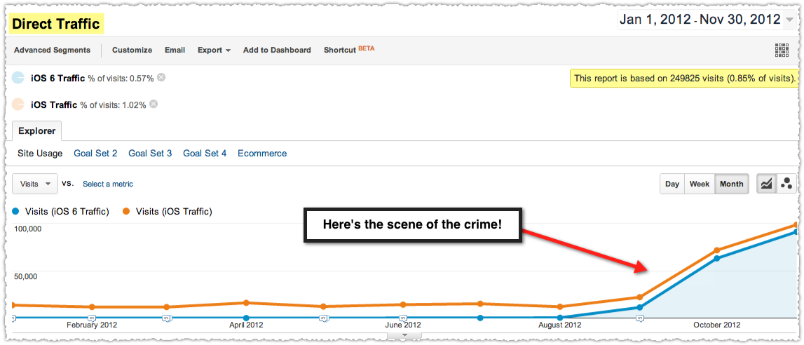
Search Theft Underway

This plainly shows that direct traffic suddenly jumped from traditional levels upon the release of iOS 6 in late September.

Reclaiming Stolen Search Traffic

Every SEO should be reclaiming this stolen traffic to ensure they (and their clients) are seeing the real picture. Here’s my simple method of figuring out how much you should take back.
Three Month iOS Direct Search Ratio

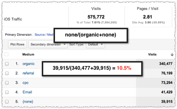
I’ve taken a three month slice of iOS traffic composed of April, May and June. From there I’m looking to see direct traffic as a percentage of the sum of direct and organic. The reason I’m not doing direct as a percentage of the total is to reduce any noise from referral spikes, paid search campaigns or other channel specific fluctuations.

In this instance direct comprises 10.5%. If you want to go the extra mile and quell the OCD demons in your head (or is that just me) you can do this for every month to ensure you’ve got the right percentage. I did and am confident that the percentage for this site is 10.5%.

Be aware, it will be different for each site.

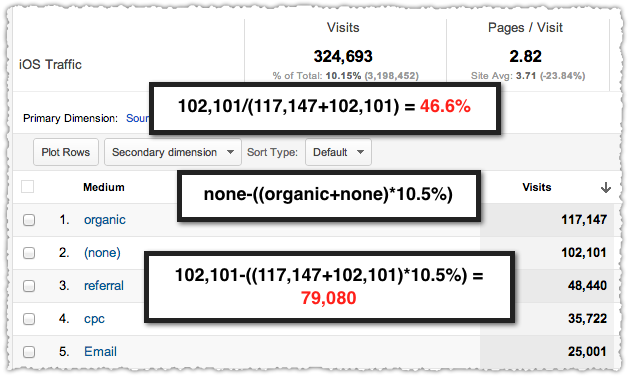
Next I look at November and perform the same calculation just to confirm that it’s out of whack. At 46.6% it’s clearly departed from the established baseline.
November Direct and Search Traffic for iOS

I simply apply the proper direct traffic percentage (10.5% in this case) to the sum of direct and organic traffic. That’s the real amount of direct traffic. I then subtract that from the reported direct traffic to find the lost search traffic number.

The equation is none-((organic+none)*percentage). In this case I just reclaimed 79,080 search visits!

Better SEO Results

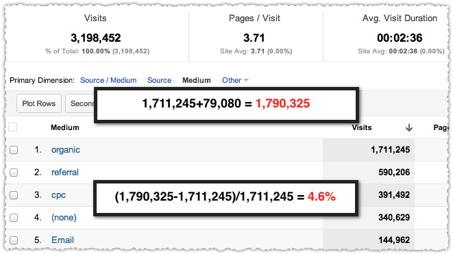
Get the credit you deserve and apply those stolen search visits to organic traffic.
November Search Lift from iOS Search

A very quick calculation shows that reclaiming iOS search traffic produced a 4.6% bump in organic traffic for this client. That’s the best 32 minutes I’ve spent in a long time. Now it’s your turn.

TL;DR

Changes in how Safari searches are passed to Google Analytics is causing organic searches to be listed under direct traffic. Give clients the real picture and get the credit you deserve by properly attributing iOS traffic.

Keyword Match Ratio

October 27 2012 // Analytics + SEO // 36 Comments

That awkward moment when you realize you’ve been staring at interesting data for years without knowing it.

That Awkward Moment When ...

Every day you’re probably using Google Keyword Tool query volume in your SEO research. Of course you have to be careful to use the correct match type, right? You don’t want to make the mistake of promising broad match level volume to a client.

Recently I began to wonder about the differences in match type volume. Because they are substantial.

Keyword Match Ratio

What am I talking about? The keyword match ratio is the broad match volume of a keyword divided by the exact match volume of a keyword.

Keyword Match Ratio Examples

I know these are completely different keywords but the difference is pretty astounding. This metric should be meaningful. It’s not some end-all-to-be-all metric, but I believe the keyword match ratio is useful.

Here’s how I’ve been looking at and using the keyword match ratio.

Determining Intent

One of the main ways I’ve been using this new metric is in determining intent. Or, more specifically, is the intent uniform or fractured?

A low keyword match ratio indicates a more uniform syntax which often maps to uniform intent. In other words, there aren’t as many keyword variations of that term or topic. Uniform intent is great from a search perspective because you can more easily deliver a relevant and valuable experience for that traffic.

A high keyword match ratio indicates a less uniform syntax which may indicate fractured intent. That means there might be a lot of ways to talk about that topic or could point to a whole modifier class. Fractured intent is more difficult to satisfy since users may come with different expectations of value.

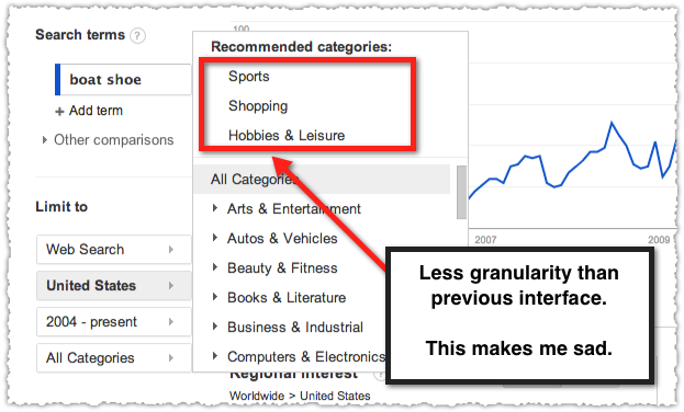
Unfortunately, determining intent got more difficult when Google reduced the level of category detail during the merge of Google Trends and Google Insights for Search.

Google Trends Category Data Limitation

You can still see that there’s potential fractured intent here but the old version would have presented the various percentage breakdowns for each category which was quite useful. Keyword match ratio provides a new way to validate whether you should be concerned about fractured intent.

Identifying Content Opportunities

The other way I’ve been using the keyword match ratio is to identify areas ripe for content creation. In this case, a high keyword match ratio indicates a potential for different modifiers and phrases for that keyword.

Hardwood Floors Keyword Match Ratio and Content Ideas

The term ‘hardwood floors’ has a pretty high keyword match ratio and even the suggested ad groups provide ample content ideas. Go a step further and use related searches and Google Autocomplete suggestions to get more ideas that match query syntax.

Hardwood Floors Related Searches

Hardwood Floors Google Autocomplete Suggestions

Look at all those content opportunities! Follow high keyword match ratios to uncover content ideas and opportunities.

Benchmarking

While I can usually just tell whether a keyword match ratio is high or low, or simply compare it to other keywords in a list, I wondered if I could create a benchmark. Enter Dr. Pete, who was kind enough to share the 1,000 keywords that comprise MozCast. (Thank you.)

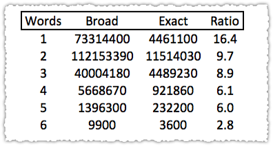
The first thing I did was see how the keyword match ratio changed with query length.

keyword match ration by query word count

As you might expect, the ratio declines as the number of words in the query increase. I like when things make sense! What this allows me to do is identify specific keywords that are materially outside of the norm.

What about the 2 word query with a ratio of 226.3 or the 2 word query with a ratio of 2.2. The ratio tells you something about the behavior of that keyword. It’s your job to figure out what it is.

Competition

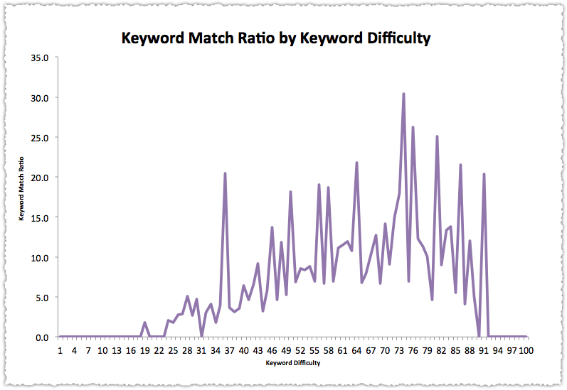
My next idea was to map the ratio to keyword difficulty. I experimented with using the competition number via the Google Keyword Tool as a proxy but the numbers were all over the place.

So … I generated the keyword difficulty for 92% of the list five painstaking keywords at a time via the SEOmoz Keyword Difficulty Tool. (There’s a 300 a day limit so I didn’t quite get through the entire list.)

Keyword Match Ratio by Keyword Difficulty Graph

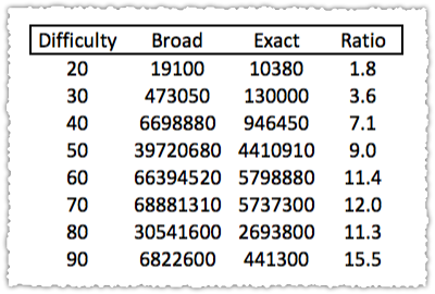
There might be a trend there but it was difficult to tell with all the noise. So I rounded keyword difficulty into deciles.

Keyword Match Ratio by Keyword Difficulty Trable

No terms fit into the 0, 10 or 100 deciles so I removed those rows from the table. What’s left does seem to indicate a rising keyword match ratio with increased keyword difficulty. That’s interesting and makes a bit of sense too. Competitive terms often have more volume and likely have a greater number of variants.

Putting It All Together

The question is how you can use all of this information together? To be honest, I haven’t come up with the perfect formula but I find it interesting to take terms and see where they fall against these benchmarks.

Swedish Fish

What about the term ‘swedish fish’? This 2 word keyword has a keyword match ratio of 3.3, well below the 2 word benchmark. In addition, with a 41% keyword difficulty it falls into the 40 bucket, which again puts it below the standard keyword match ratio for that difficulty.

That tells me the intent behind the term ‘swedish fish’ is uniform and it might be an area where a well optimized piece of content could rank well. Yum!

A term with a low keyword match ratio and low competition is a great SEO opportunity.

The syntax and intent are clear and you can provide relevant and useful content to fill that need. Of course, all of this has to produce productive traffic. We’re not doing SEO just for gold stars and pats on the back, right?
Solar Panels

What about a term like ‘solar panels’? It has a keyword match ratio of 13.5, above the 2 word benchmark. With a keyword difficulty of 70% it also scores slightly over the average.

That tells me optimizing for ‘solar panels’ is going to be a hot mess. Instead, I’d want to look for phrases and modifiers that might be more attractive instead, with the long-term goal of building up to this head term.

Locate the specific intents and keywords that contribute to a high keyword match ratio and produce relevant content that satisfies and engages.

Context, Brains and Disclaimers

A couple of things you should know about the keyword match ratio. You need to use it in conjunction with other tools, in particular your brain. Context is important and different verticals and modifiers will have different keyword match ratio patterns.

So while I provide the benchmarks above you should be thinking about how the ratio fits into the keyword universe for your site, or for that particular modifier. If you were a coupon site you might want to see which store + coupons terms had the highest and lowest keyword match ratio.

There’s also the possibility that the set of data I used for the benchmark isn’t representative. However, I think Dr. Pete has done a pretty good job here and while some of the terms are strange and mundane that’s not a bad reflection of reality.

You’ll also note that I’m not doing any heavy duty statistical analysis here. While I understand and enjoy those endeavors I think pattern recognition can take you pretty far pretty quickly. Maybe someone else can pick up this thread and create something more statistically valid.

In the interim, I’m using the keyword match ratio as an SEO hack to help me find potential diamonds in the rough and areas for content creation.

TL;DR

The keyword match ratio measures the ratio of broad match volume and exact match volume. This metric is not fool proof. You need to use your brain when looking at it. But if you’ve got a good head on your shoulders the keyword match ratio can help you determine intent and sniff out content opportunities.

Google Analytics Y Axis Scale

June 20 2012 // Analytics // 6 Comments

One of the things that bothered me about the ‘new’ Google Analytics was the relative y axis. Google Analytics would chart traffic on a much smaller scale based on the time period and traffic volume.

Relative Y Axis

So if you had daily traffic between 12,000 and 14,000 visits the scale might be from 10,000 to 15,000. The result? Fluctuations in traffic appeared much bigger than they were in reality.

Top Secret Movie Big Phone Gag

This caused a number of people to panic. Frantic emails were sent. Even after they understood that the seemingly large drop in traffic was only 2% (and could be chalked up to a holiday weekend) the visual cue was unnerving. Information aesthetics matter!

Absolute Y Axis

I lived with (but didn’t like) the relative graphing feature. I mean, Google Analytics is a free product so I can’t get too worked up about it. But the other day as I refreshed one of my advanced segments the graph got all screwy and I had to reload Google Analytics entirely.

Google Analytics Graph with an Absolute Y Axis

The graph started from zero! Things looked ‘right’ again. Was this a permanent change? I reached out to Adam Singer who looped in Justin Cutroni who confirmed the return of the absolute axis.

We heard from a lot of people that the relative axis was sub-optimal. So the absolute axis is back!

I am very pleased that Google Analytics has reverted to the absolute axis and believe it conveys the information in a more ‘honest’ way. So, from one user, thank you.

2012 Internet, SEO and Technology Predictions

December 27 2011 // Analytics + SEO + Technology // 8 Comments

It’s time again to gaze into my crystal ball and make some predictions for 2012.

Crystal Ball Technology Predictions

2012 Predictions

For reference, here are my predictions for 2011, 2010 and 2009. I was a bit too safe last year so I’m making some bold predictions this time around.

Chrome Becomes Top Browser

Having already surpassed Firefox this year, Chrome will see accelerated adoption, surpassing Internet Explorer as the top desktop browser in the closing weeks of 2012.

DuckDuckGo Cracks Mainstream

Gabriel Weinberg puts new funding to work and capitalizes on the ‘search is about answers’ meme. DuckDuckGo leapfrogs over AOL and Ask in 2012, securing itself as the fourth largest search engine.

Google Implements AuthorRank

Google spent 2011 building an identity platform, launching and aggressively promoting authorship while building an internal influence metric. In 2012 they’ll put this all together and use AuthorRank (referred to in patents as Agent Rank) as a search signal. It will have a more profound impact on search than all Panda updates combined.

Image Search Gets Serious

Pinterest. Instagram. mlkshk. We Heart It. Flickr. Meme Generator. The Internet runs on images. Look for a new image search engine, as well as image search analytics. Hopefully this will cause Google to improve (which is a kind word) image search tracking within Google Analytics.

SEO Tool Funding

VCs have been sniffing around SEO tool providers for a number of years. In 2012 one of the major SEO tool providers (SEOmoz or Raven) will receive a serious round of funding. I actually think this is a terrible idea but … there it is.

Frictionless Check-Ins

For location based services to really take off and reach the mainstream they’ll need a near frictionless check-in process. Throughout 2012 you’ll see Facebook, Foursquare and Google one-up each other in providing better ways to check-in. These will start with prompts and evolve into check-out (see Google Wallet) integrations.

Google+ Plateaus

As much as I like Google+ I think it will plateau in mid-2012 and remain a solid second fiddle to Facebook. That’s not a knock of Google+ or the value it brings to both users and Google. There are simply too many choices and no compelling case for mass migration.

HTML5 (Finally) Becomes Important

After a few years of hype HTML5 becomes important, delivering rich experiences that users will come to expect. As both site adoption and browser compatibility rise, search engines will begin to use new HTML5 tags to better understand and analyze pages.

Schema.org Stalls

Structured mark-up will continue to be important but Schema.org adoption will stall. Instead, Google will continue to be an omnivore, happy to digest any type of structured mark-up, while other entities like Facebook will continue to promote their own proprietary mark-up.

Mobile Search Skyrockets

Only 40% of U.S. mobile users have smartphones. That’s going to change in a big way in 2012 as both Apple and Google fight to secure these mobile users. Mobile search will be the place for growth as desktop search growth falls to single digits.

Yahoo! Buys Tumblr

Doubling down on content Yahoo! will buy Tumblr, hoping to extend their contributor network and overlay a sophisticated, targeted display advertising network. In doing so, they’ll quickly shutter all porn related Tumblr blogs.

Google Acquires Topsy

Topsy, the last real-time search engine, is acquired by Google who quickly shuts down the Topsy API and applies the talent to their own initiatives on both desktop and mobile platforms.

Not Provided Keyword Not A Problem

November 21 2011 // Analytics + Rant + SEO // 16 Comments

Do I think Google’s policy around encrypting searches (except for paid clicks) for logged-in users is fair? No.

Fair Is Where You Get Cotton Candy

But whining about it seems unproductive, particularly since the impact of (not provided) isn’t catastrophic. That’s right, the sky is not falling. Here’s why.

(Not Provided) Keyword

By now I’m sure you’ve seen the Google Analytics line graph that shows the rise of (not provided) traffic.

Not Provided Keyword Google Analytics Graph

Sure enough, 17% of all organic Google traffic on this blog is now (not provided). That’s high in comparison to what I see among my client base but makes sense given the audience of this blog.

Like many others (not provided) is also my top keyword by a wide margin. I think seeing this scares people but it makes perfect sense. What other keyword is going to show up under every URL?

Instead of staring at that big aggregate number you have to look at the impact (not provided) is having on a URL by URL basis.

Landing Page by Keywords

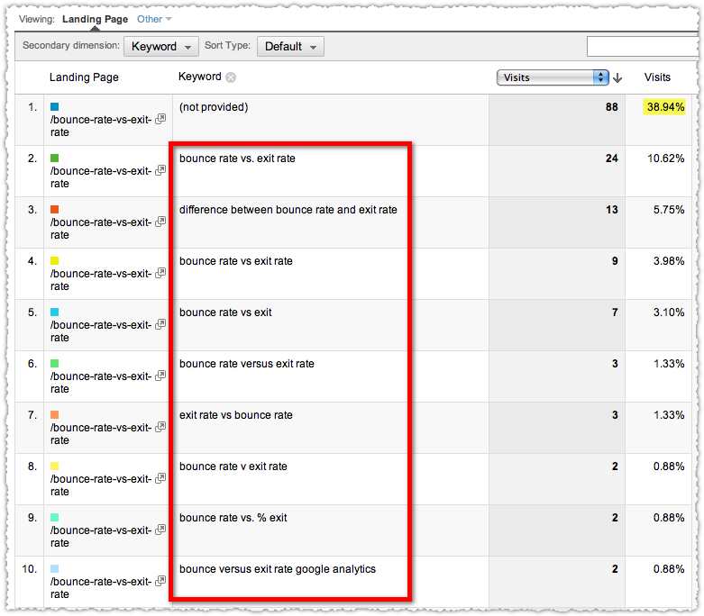
To look at the impact of (not provided) for a specific URL you need to view your Google organic traffic by Landing Page. Then drill down on a specific URL and use Keyword as your secondary dimension. Here’s a sample landing page by keywords report for my bounce rate vs exit rate post.

Landing Page by Keyword Report with Not Provided

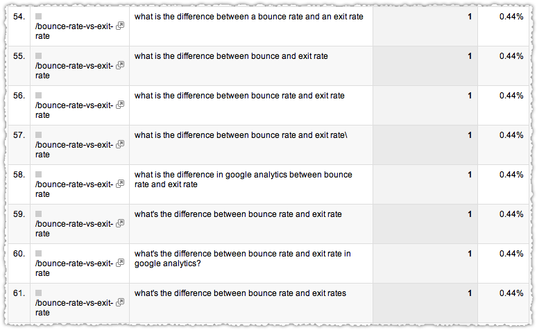
In this example, a full 39% of the traffic is (not provided). But a look at the remaining 61% makes it pretty clear what keywords bring traffic to this page. In fact, there are 68 total keywords in this time frame.

Keyword Clustering Example

Clustering these long-tail keywords can provide you with the added insight necessary to be confident in your optimization strategy.

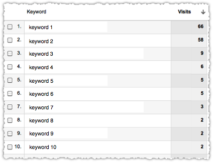
(Not Provided) Keyword Distribution

The distribution of keywords outside of (not provided) gives us insight into the keyword composition of (not provided). In other words, the keywords we do see tell us about the keywords we don’t.

Do we really think that the keywords that make up (not provided) are going to be that different from the ones we do see? It’s highly improbable that a query like ‘moonraker steel teeth’ is driving traffic under (not provided) in my example above.

If you want to take things a step further you can apply the distribution of the clustered keywords against the pool of (not provided) traffic. First you reduce the denominator by subtracting the (not provided) traffic from the total. In this instance that’s 208 – 88 which is 120.

Even without any clustering you can take the first keyword (bounce rate vs. exit rate) and determine that it comprises 20% of the remaining traffic (24/120). You can then apply that 20% to the (not provided) traffic (88) and conclude that approximately 18 visits to (not provided) are comprised of that specific keyword.

Is this perfectly accurate? No. Is it good enough? Yes. Keyword clustering will further reduce the variance you might see by specific keyword.

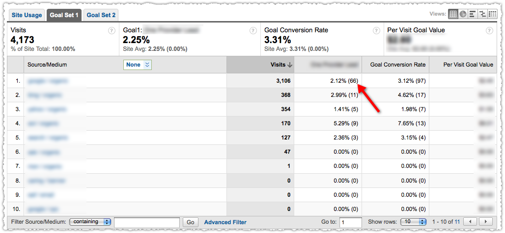
Performance of (Not Provided) Keywords

The assumption I’m making here is that the keyword behavior of those logged-in to Google doesn’t differ dramatically from those who are not logged-in. I’m not saying there might not be some difference but I don’t see the difference being large enough to be material.

If you have an established URL with a history of getting a steady stream of traffic you can go back and compare the performance before and after (not provided) was introduced. I’ve done this a number of times (across client installations) and continue to find little to no difference when using the distribution method above.

Even without this analysis it comes down to whether you believe that query intent changes based on whether a person is logged-in or not? Given that many users probably don’t even know they’re logged-in, I’ll take no for 800 Alex.

What’s even more interesting is that this is information we didn’t have previously. If by chance all of your conversions only happen from those logged-in, how would you have made that determination prior to (not provided) being introduced? Yeah … you couldn’t.

While Google has made the keyword private they’ve actually broadcast usage information.

(Not Provided) Solutions

Keep Calm and SEO On

Don’t get me wrong. I’m not happy about the missing data, nor the double standard between paid and organic clicks. Google has a decent privacy model through their Ads Preferences Manager. They could adopt the same process here and allow users to opt-out instead of the blanket opt-in currently in place.

Barring that, I’d like to know how many keywords are included in the (not provided) traffic in a given time period. Even better would be a drill-down feature with traffic against a set of anonymized keywords.

Google Analytics Not Provided Keyword Drill Down

However, I’m not counting on these things coming to fruition so it’s my job to figure out how to do keyword research and optimization given the new normal. As I’ve shown, you can continue to use Google Analytics, particularly if you cluster keywords appropriately.

Of course you should be using other tools to determine user syntax, identify keyword modifiers and define query intent. When keyword performance is truly in doubt you can even resort to running a quick AdWords campaign. While this might irk you and elicit tin foil hat theories you should probably be doing a bit of this anyway.

TL;DR

Google’s (not provided) policy might not be fair but is far from the end of the world. Whining about (not provided) isn’t going to change anything. Figuring out how to overcome this obstacle is your job and how you’ll distance yourself from the competition.

Image Search in Google Analytics

July 26 2011 // Analytics + SEO // 19 Comments

Think you got a bump from Panda 2.3? Not so fast.

Image Search Analytics

In looking at a number of client sites I notice that image search traffic, tracked under referring traffic (google.com / referral) with the referral path of imgres, fell off a cliff as of July 23rd.

Where'd My Image Traffic Go?

Where did that image traffic go? Organic.

Organic Image Search Traffic Bump

So if you thought you’d been the beneficiary of Panda 2.3 (launched late last week), you might want to make sure it’s not a phantom image search bump.

The Definition of Organic

At present I can’t find an easy way within Google Analytics to distinguish between organic traffic that is search based versus image based. That strikes me as a step back since these forms of traffic are not homogeneous in nature. Lumping image search in with organic is like smearing vaseline on your windshield. I can still see, just not as well as I could before.

There’s probably a hack you can put together via filters, but most users won’t make that effort.

Where’s Image Search?

This isn’t the first time Google has played Where’s Waldo with image search. On May 6th, 2010 Google moved image search traffic from images.google.com to google.com.

images.google.com traffic drop

At least that time you could wander around Google Analytics and spot the new source/medium that would provide the same level of specificity. Oddly, you’d still see some stray images.google.com traffic after this change. I always meant to track that down but never got around to it. This new update seems to finish the job and eliminate the remaining images.google.com traffic that had been trickling in.

New Dimension Please

I am hoping that this is just evidence that Google Analytics will launch a new dimension so we can separate these two different types of search traffic. Yet, you’d think they’d launch the dimension before migrating the traffic.

For a long time I figured that these changes were an indication that image search was the ugly duckling of the bunch. But recent events make me believe that Google is very invested in image search, so why the lack viable reporting? No, ‘it’s free’ is not the right answer.

I’m waiting to hear from a few Google sources and will update this post if I get any type of insight or confirmation. Until then, how do you feel about this change?

Google Analytics Userscripts

February 17 2011 // Analytics // 1 Comment

If you spend a lot of time in Google Analytics you may quickly find yourself frustrated with the user experience. Here are 3 userscripts that make using Google Analytics way more efficient.

What are Userscripts?

Userscripts are small pieces of JavaScript code that tweak or provide additional functionality to your web experience. You install userscripts as a simple add-on in Chrome, Firefox (requires Greasemonkey) or Internet Explorer (requires IE7Pro).

In a nutshell, userscripts make things better. A lot better.

Cleaner Profile Switching

This userscript lets you switch from one Google Analytics profile to another and see the same report. It also gives you the option of opening that new profile in a separate tab.

Cleaner Profile Switching Userscript

This is a huge time saver if you’ve got multiple profiles (which you should) since you won’t have to build the report from scratch each time.

Get it: Cleaner Profile Switching

Absolute Conversion

This userscript calculates and displays the number of conversions next to the conversion rate.

Absolute Conversion Userscript

So instead of navigating to the Goals menu or doing some math in your head, you can quickly see your conversion numbers. Please note that while this is a handy userscript, it breaks when Google Analytics samples data.

Get it: Absolute Conversion Userscript

Accordion Menu

This userscript makes all of the top level Google Analytics menus expandable without waiting for the browser to reload.

If you use Google Analytics often, you probably get tired of clicking on main section report titles, only to wait for it to load so you can click on sub-reports. Think about it, how many times have you clicked on “Traffic Sources” with the full intention of clicking on “All Traffic Sources” as soon as possible? Or “Content” just to get to “Top Content”.

This userscript is a massive time saver.

Get it: Accordion Menu Userscript

Using Userscripts

I should warn you that userscripts can sometimes be janky and cause problems. In fact this post was originally going to feature four userscripts until I noted a problem with one of them. Don’t let this keep you from trying them out. Userscripts are super easy to uninstall and many of the creators are eager to get feedback on how to improve them.

Give these Google Analytics userscripts a try and let me know if you have any others you swear by.

SEO Status Codes

January 20 2011 // Analytics + SEO // 5 Comments

One of the more technical aspects of SEO is to understand, monitor and manage status codes.

Soup Nazi 400 Bad Request

What are Status Codes?

Status Codes are an essential part of HTTP, the request-response protocol that powers the Internet. Each time someone visits a page (including Googlebot) they ask the site for information. The status code is a numeric response to that request and provides guidance on how to proceed. You might be familiar with status codes such as 404 and 301.

SEO Status Codes

I recommend bookmarking the status code definitions documented by the W3C. However, I want to provide a quick reference guide specifically for SEO.

200

OK or Success. This is the response code you want to see most often. At a minimum, I want Googlebot to see a 200 response code in 90% or more instances during a crawl.

301

Moved permanently. This is the right way to redirect, telling search engines to index that content in a new location.

302

Moved temporarily. This is the wrong way to redirect (except in very rare cases). You’re essentially putting this content into limbo because it’s not at the current location but search engines won’t index the temporary location.

304

Not modified. This can be used for crawl efficiency, telling search engines that the content has not changed. You’re basically telling Googlebot not bother and to move on to other content. The advent of Caffeine may have made this unnecessary but I think it’s still worthwhile.

404

Not found. This happens when the client can’t find the content at that specific location. Too many 404s are bad. In my experience having too many is a negative algorithmic signal. Google simply doesn’t trust that sending a user to that site will be a positive experience.

I don’t have a hard and fast number for when 404s become problematic. I believe it’s probably based on a percentage of total requests to that site. As such, it’s just good practice to reduce the number of 404s.

That does not mean zero! I don’t recommend putting a 301 in place when it should return a 404. A request for domain.com/foo should return a 404. Ditto for returning a 200 when it should be a 404. (Yes, I’ve seen this lately.) I’d be surprised if having no 404s wasn’t also some sort of red flag.

410

Gone. If you know that content no longer exists, just say so. Don’t encourage Googlebot to come back again and again and again via a 404 which doesn’t tell it why that page no longer exists.

500

Internal Server Error. This generally means that the client never received an appropriate response from the site. 500 errors basically tell the search engine that the site isn’t available. Too many 500 errors call into question the reliability of that site. Google doesn’t want to send users to a site that ultimately times out and doesn’t load.

How to Track Status Codes

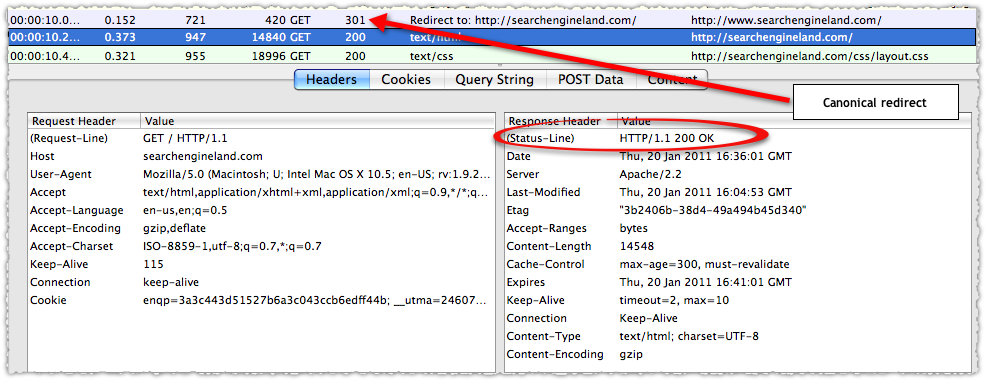
There are a number of ways you can track status codes. For spot checking purposes, I recommend installing one of two Firefox add-ons: HttpFox or Live HTTP Headers. These add-ons let you look at the communication between user agent and client. For example, what happens when I type ‘www.searchengineland.com’ directly into my browser bar.

HttpFox Example

Using HttpFox I see that it performs a 301 redirect to the non-www version and then resolves successfully. Google Webmaster Tools also provides you with nice insight through the Crawl Errors reporting interface.

But if you really want to use status codes to your benefit you’ll need to count and track them every day via log file analysis. I recommend creating a daily output that provides the count of status codes encountered by Googlebot and Bingbot.

Status Code Reports

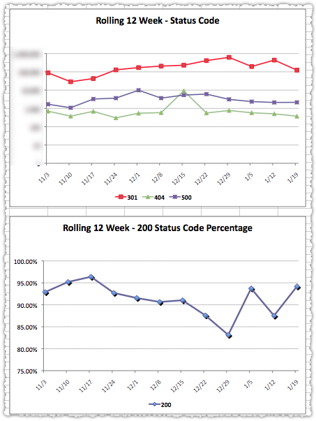
Using those daily numbers you can construct insightful and actionable dashboard graphs.
Sample Status Code Reports

While this may take some doing, the investment is worthwhile. You can quickly identify and resolve 404s and 500s. Many will find it helpful to have this data (concrete numbers!) so you can prioritize issues within a larger organization.

You’ll also gain insight into how long it takes search engines to ‘digest’ a 301 and much more. Status code management can be a valuable part of an advanced SEO program.

Optimize Your Sitemap Index

January 11 2011 // Analytics + SEO // 20 Comments

Information is power. It’s no different in the world of SEO. So here’s an interesting way to get more information on indexation by optimizing your sitemap index file.

What is a Sitemap Index?

A sitemap index file is simply a group of individual sitemaps, using an XML format similar to a regular sitemap file.

You can provide multiple Sitemap files, but each Sitemap file that you provide must have no more than 50,000 URLs and must be no larger than 10MB (10,485,760 bytes). […] If you want to list more than 50,000 URLs, you must create multiple Sitemap files.

If you do provide multiple Sitemaps, you should then list each Sitemap file in a Sitemap index file.

Most sites begin using a sitemap index file out of necessity when they bump up against the 50,000 URL limit for a sitemap. Don’t tune out if you don’t have that many URLs. You can still use a sitemap index to your benefit.

Googling a Sitemap Index

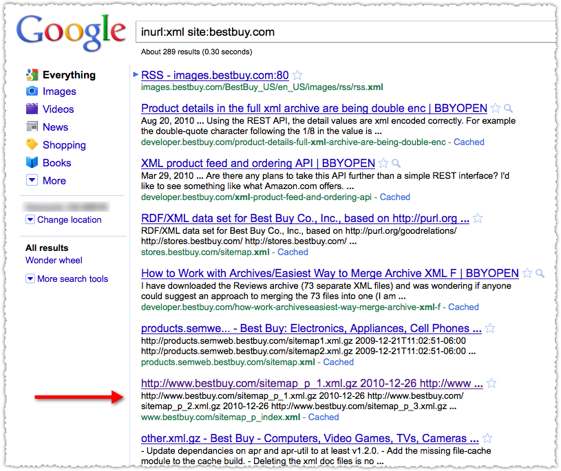
I’m going to search for a sitemap index to use as an example. To do so I’m going to use the inurl: and site: operators in conjunction.

Google a Sitemap Index

Best Buy was top of mind since I recently bought a TV there and I have a Reward Zone credit I need to use. The sitemap index wasn’t difficult to find in this case. However, they don’t have to be named as such. So if you’re doing some competitive research you may need to poke around a bit to find the sitemap index and then validate that it’s the correct one.

Opening a Sitemap Index

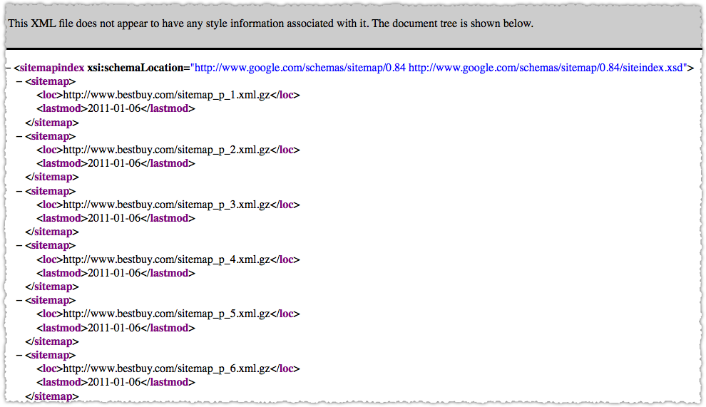
You can then click on the result and see the individual sitemaps.

Inspect Sitemap Index

Here’s what the sitemap index looks like. A listing of each individual sitemap. In this case there are 15 of them, all sequentially numbered.

Looking at a Sitemap

The sitemaps are compressed using gzip so you’ll need to extract them to look at an individual sitemap. Copy the URL into your browser bar and the rest should take care of itself. Fire up your favorite text program and you’re looking at the individual URLs that comprise that sitemap.

Best Buy Sitemap Example

So within one of these sitemaps I quickly find that there are URLs that go to a TV a Digital Camera and a Video Game. They are all product pages but there doesn’t seem to be any grouping by category. This is standard, but it’s not what I’d call optimized.

Sitemap Index Metrics

Within Google Webmaster tools you’ll be able to see the number of URLs submitted and the number indexed by sitemap

Here’s an example (not Best Buy) of sitemap index reporting in Google Webmaster tools.

Sitemap Index Metric Sample

So in the case of the Best Buy sitemap index, they’d be able to drill down and know the indexation rate for each of their 15 sitemaps.

What if you created those sitemaps with a goal in mind?

Sitemap Index Optimization

Instead using some sequential process and having products from multiple categories in an individual sitemap, what if you created a sitemap specifically for each product type?

  • sitemap.tv.xml
  • sitemap.digital-cameras.xml
  • sitemap.video-games.xml

In the case of video games you might need multiple sitemaps if the URL count exceeds 50,000. No problem.

  • sitemap.video-games-1.xml
  • sitemap.video-games-2.xml

Now, you’d likely have more than 15 sitemaps at this point but the level of detail you suddenly get on indexation is dramatic. You could instantly find that TVs were indexed at a 95% rate while video games were indexed at a 56% rate. This is information you can use and act on.

It doesn’t have to be one dimensional either, you can pack a lot of information into individual sitemaps. For instance, maybe Best Buy would like to know the indexation rate by product type and page type. By this I mean, would Best Buy want to know the indexation rate of category pages (lists of products) versus product pages (an individual product page.)

To do so would be relatively straight forward. Just split each product type into separate page type sitemaps.

  • sitemap.tv.category.xml
  • sitemap.tv.product.xml
  • sitemap.digital-camera.category.xml
  • sitemap.digital-camera.product.xml

And so on and so forth. Grab the results from Webmaster Tools and drop them into Excel and in no time you’ll be able to slice and dice the indexation rates to answer the following questions. What’s the indexation rate for category pages versus product pages? What’s the indexation rate by product type?

You can get pretty granular if you want though you can only pack each sitemap index with 50,000 sitemaps. Then again, you’re not limited to just one sitemap index either!

In addition, you don’t need 50,000 URLs to use a sitemap index. Each sitemap could contain a small amount of URLs, so don’t pass on this type of optimization thinking it’s just for big sites.

Connecting the Dots

Knowing the indexation rate for each ‘type’ of content gives you an interesting view into what Google thinks of specific pages and content. The two other pieces of the puzzle are what happens before (crawl) and after (traffic). Both of these can be solved.

Crawl tracking can done by mining weblogs for Googlebot (and Bingbot) by the same sitemap criteria. So, not only do I know how much bots are crawling each day I know where they’re crawling. As you make SEO changes, you are then able to see how it impacts the crawl and follow it through to indexation.

The last step is mapping it to traffic. This can be done by creating Google Analytics Advanced Segments that match the sitemaps using regular expressions. (RegEx is your friend.) With that in place, you can track changes in the crawl to changes in indexation to changes in traffic. Nirvana!

Go to the Moon

Doing this is often not an easy exercise and may, in fact, require a hard look at site architecture and URL naming conventions. That might not be a bad thing in some cases. And I have implemented this enough times to see the tremendous value it can bring to an organization.

I know I covered a lot of ground so please let me know if you have any questions.

2011 Predictions

December 31 2010 // Analytics + Marketing + SEO + Social Media + Technology + Web Design // 3 Comments

Okay, I actually don’t have any precognitive ability but I might as well have some fun while predicting events in 2011. Lets look into the crystal ball.

2011 Search Internet Technology Predictions

Facebook becomes a search engine

The Open Graph is just another type of index. Instead of crawling the web like Google, Facebook lets users do it for them. Facebook is creating a massive graph of data and at some point they’ll go all Klingon on Google and uncloak with several bird of prey surrounding search. Game on.

Google buys Foursquare

Unless you’ve been under a rock for the last 6 months it’s clear that Google wants to own local. They’re dedicating a ton of resources to Places and decided that getting citations from others was nice but generating your own reviews would be better. With location based services just catching on with the mainstream, Google will overpay for Foursquare and bring check-ins to the masses.

UX becomes more experiential

Technology (CSS3, Compass, HTML5, jQuery, Flash, AJAX and various noSQL databases to name a few) transforms how users experience the web. Sites that allow users to seamlessly understand applications through interactions will be enormously successful.

Google introduces more SEO tools

Google Webmaster Tools continues to launch tools that will help people understand their search engine optimization efforts. Just like they did with Analytics, Google will work hard in 2011 to commoditize SEO tools.

Identity becomes important

As the traditional link graph becomes increasingly obsolete, Google seeks to leverage social mentions and links. But to do so (in any major way) without opening a whole new front of spam, they’ll work on defining reputation. This will inevitably lead them to identity and the possible acquisition of Rapleaf.

Internet congestion increases

Internet congestion will increase as more and more data is pushed through the pipe. Apps and browser add-ons that attempt to determine the current congestion will become popular and the Internati will embrace this as their version of Greening the web. (Look for a Robert Scoble PSA soon.)

Micropayments battle paywalls

As the appetite for news and digital content continues to swell, a start-up will pitch publications on a micropayment solution (pay per pageview perhaps) as an alternative to subscription paywalls. The start-up may be new or may be one with a large installed user base that hasn’t solved revenue. Or maybe someone like Tynt? I’m crossing my fingers that it’s whoever winds up with Delicious.

Gaming jumps the shark

This is probably more of a hope than a real prediction. I’d love to see people dedicate more time to something (anything!) other than the ‘push-button-receive-pellet’ games. I’m hopeful that people do finally burn out, that the part of the cortex that responds to this type of gratification finally becomes inured to this activity.

Curation is king

The old saw is content is king. But in 2011 curation will be king. Whether it’s something like Fever, my6sense or Blekko, the idea of transforming noise into signal (via algorithm and/or human editing) will be in high demand, as will different ways to present that signal such as Flipboard and Paper.li.

Retargeting wins

What people do will outweigh what people say as retargeting is both more effective for advertisers and more relevant for consumers. Privacy advocates will howl and ally themselves with the government. This action will backfire as the idea of government oversight is more distasteful than that of corporations.

Github becomes self aware

Seriously, have you looked at what is going on at Github? There’s a lot of amazing work being done. So much so that Github will assemble itself Voltron style and become a benevolently self-aware organism that will be our digital sentry protecting us from Skynet.

xxx-bondage.com