In my last post I covered SEO Excel functions. In this post I’m going to cover something even more valuable to SEO – pivot tables. Excel defines a PivotTable as follows:
A PivotTable report is an interactive table that combines and compares large amounts of data. You can rotate its rows and columns to see different summaries of the source data, and you can display the details for areas of interest.
Use a PivotTable report when you want to analyze related totals, especially when you have a long list of figures to sum and you want to compare several facts about each figure. Because a PivotTable report is interactive, you can change the view of the data to see more details or calculate different summaries, such as counts or averages.
What does a pivot table really do? A pivot table lets you slice and dice a big set of data.
Top Queries Pivot Table
Instead of using dummy data I’m going to show how to generate a pivot table report using the new Google Webmaster Top Queries report. I’ll be using Excel 2008 for Mac which is different (probably more difficult) than the PC version.
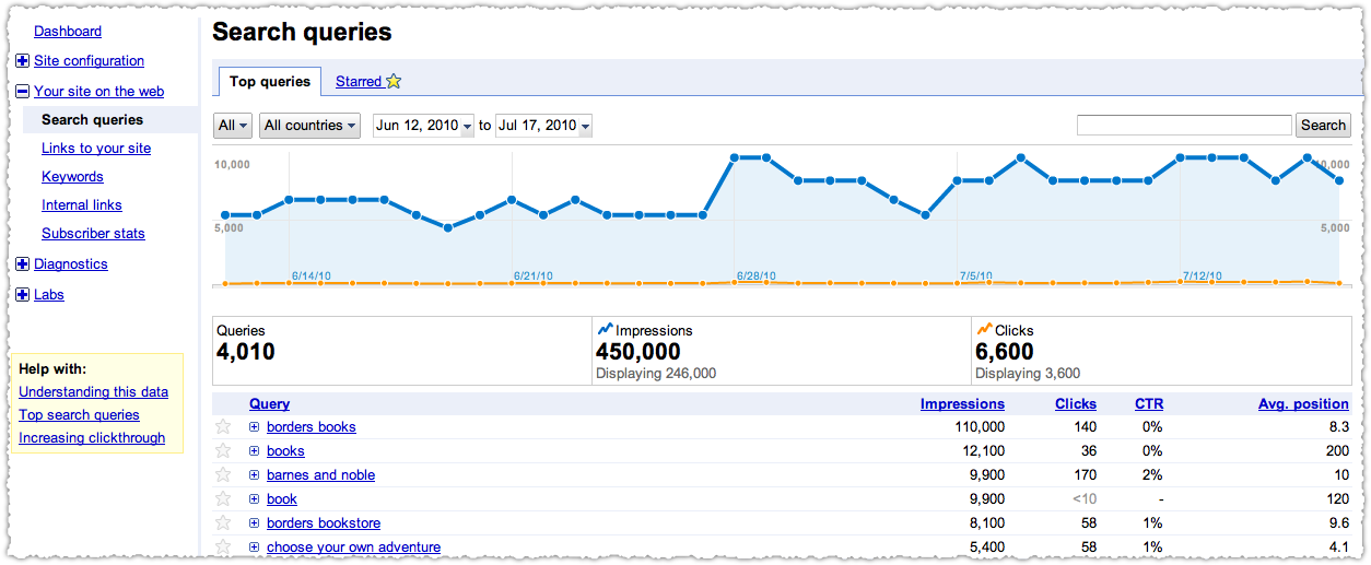
Obviously we need to the Search queries report in Google Webmaster Tools.

At the bottom of this report you can download the table.

What’s really nice is that it will actually download all of the data, not just the 100 queries on the page but all (4,010 in this case) queries. Other Google products could benefit from this feature. I’m looking at you Google Analytics.
The Data Table
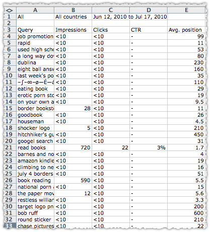
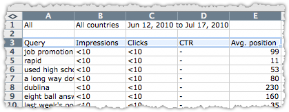
What you download is a big CSV file. (CSV stands for Comma Separated Values if you’re interested.) It will look like this when you open it.

It’s certainly interesting but reading it line by line isn’t very useful or efficient. There are plenty of things you can do to make it easier to digest. You could sort it (by Impressions) or filter it (by Avg. position) but a pivot table can really make sense of the complex.
Before I go on I’m going to Save As, rename the file and change the file type to Excel. This is just a safeguard and good general practice.
Select The Data
Next, you’ll want to select the data you want to include in your pivot table. This doesn’t mean just the rows or columns you want. Instead, you’re going to select the entire set of data you just downloaded. Selecting it is actually really easy.
Click on the top left cell of the data. In this case it’s going to be cell A3 with the text ‘Query’ in it. Then hold shift-ctrl and tap the right arrow once (but don’t let go just yet). When you do this all the relevant columns in the entire top row should be highlighted.

Keep holding shift-ctrl keys down and then tap the down arrow once. When you do this all the rows in the data table should be highlighted.

The shift-ctrl-arrow or shift-apple-arrow shortcut selects everything until it hits a blank cell. It’s a nifty time-saving shortcut for any Excel work.
Create The Pivot Table
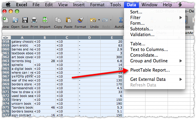
At this point you can let go and, with the entire data table highlighted, select PivotTable Report from the Data menu.

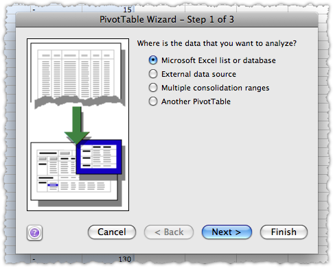
This will launch the PivotTable Wizard.

Since you’ve already selected the data (which is what you’d do in step 2) you can actually skip steps 2 and 3 and just click Finish. When you do, a new Excel tab is created and you’re staring at an empty pivot table.

In my experience this is where most people get scared off. It’s like Excel is taunting you – demanding you to drop fields and data. It looks more daunting than it is and you can always undo or even create a brand new pivot table. As in nearly all things, trial and error is a great teacher.
It’s probably easier to show you how to do this rather than explain what each part means in the abstract. So lets create a pivot table that shows the total number of impressions, clicks and click through rate (CTR) by position. That would be handy, right?
Insert Pivot Table Fields
First you’ll want to drag the Avg. position field button to the row area. If you don’t see those field buttons, just click anywhere in the pivot table and they’ll magically appear.

In this instance there are no columns so we’ll move swiftly on to data.

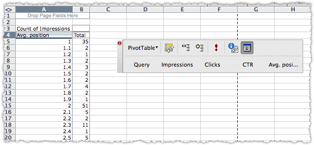
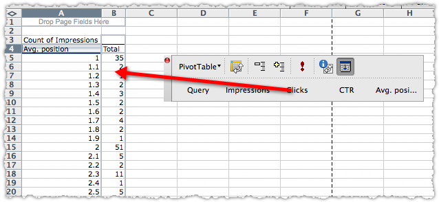
Drag the Impressions button into the data area.

The result will look like this.

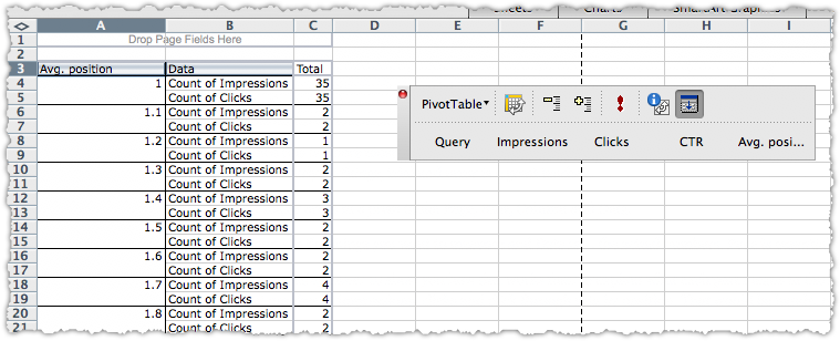
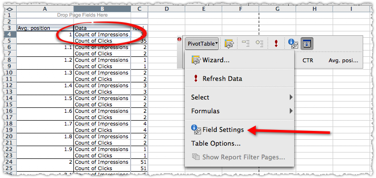
It looks wrong, I know! But be patient, we’ll fix that in short order. Next drag the Clicks into the data area.

The result will now look like this.

Change Field Settings
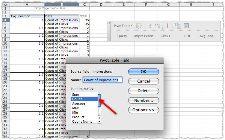
You don’t want to count impressions or clicks you want to sum impressions and clicks. To do this click on the first Count of Impressions cell (B4 in this case), then click the PivotTable button and select Field Settings.

After you do this you’ll be able to change the field from a count to a sum.

Click on Sum and then click OK.

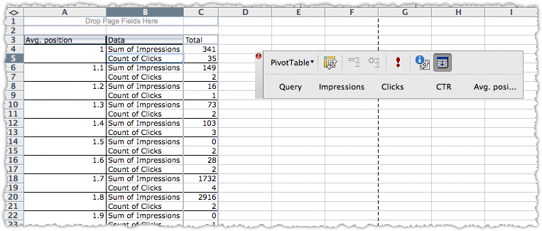
Now we’ve finally got the right metric and you’re seeing the total number of impressions by position. Simply repeat the same process for Clicks so that you have both Sum of Impressions and Sum of Clicks.
Create a Calculated Field
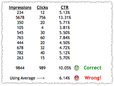
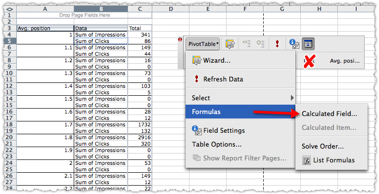
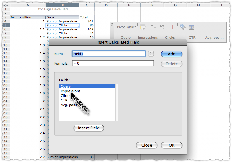
You might now be tempted to drag CTR into the data area. Don’t! Averaging a set of percentages will not give you the results you want. Instead you need to create a calculated field. Click the PivotTable button, then select Formulas -> Calculated Field… from the drop down menu.

Now you get to create a Calculate Field. Again, much easier than it sounds.

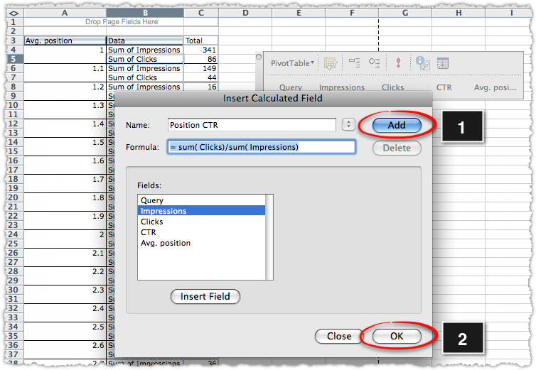
You’ll first give this calculated field a name. The name CTR is already taken so I’m going to name it CTR by Position. Then create the calculation by typing in functions, highlighting and inserting fields. This is what it should look like before you (1) click the Add button and the (2) click OK.

Formatting Fields
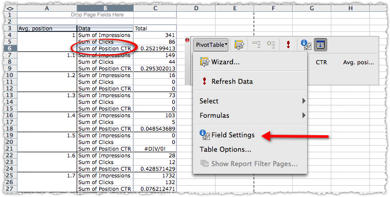
Now you’re got the total number of Impressions, Clicks and CTR by position. But the formatting on the CTR is annoying. So lets change that. Click on the first Sum of Position CTR cell (B6 in this case), then click the PivotTable button and select Field Settings.

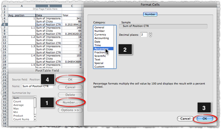
This brings you to a two pane process where you will (1) click Number… and (2) select Percentage from the Category menu and (3) click OK which takes you back to the first window where you will (4) click OK again.

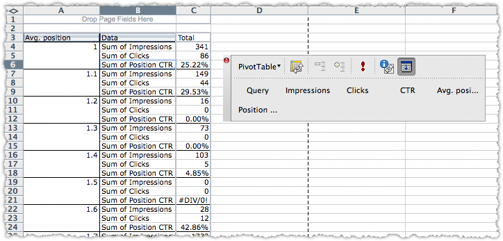
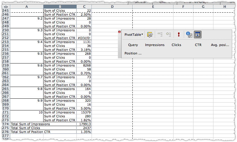
At the end of all that you get a fairly easy to read table that shows impressions, clicks and CTR by position.

Filtering Pivot Tables
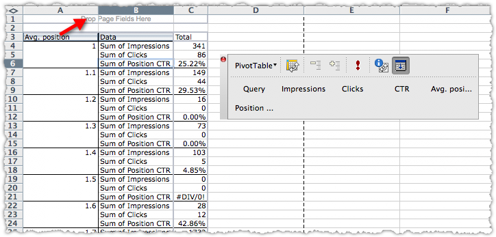
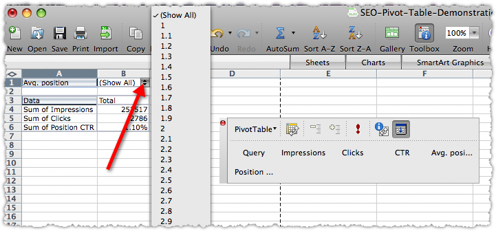
What if you wanted to just see the data for a specific position? No problem. Drag the Avg. position field from the row area into the page area.

Once the pivot table changes, you can then select the position you want to see using the drop down filter.

I’m going to select 1.7 as my position. At that point I might want to see what actual terms drove traffic at that position. To do that, drag the Query button to the column area. (You didn’t think we’d ignore the column area completely, did you?)

Now I get to see what terms drove traffic at the 1.7 rank and how effective each term was at that position.

Yes, my used books blog is getting a fair amount of traffic on the term ‘dr. evil’. (Image optimization works folks.)
Hopefully, you can envision another pivot table with Query as rows, search engines as columns and keyword rank as data. That’s a nice little table to have in your back pocket.
Hide Pivot Table Items
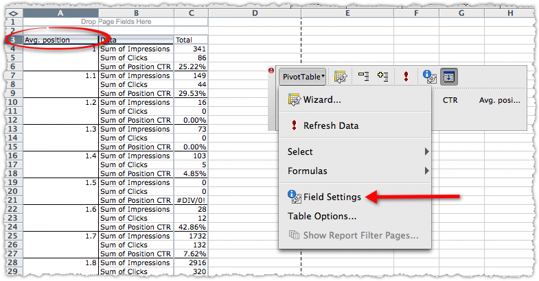
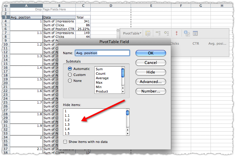
Still with me? I’m going to do a few other things that you might find useful. I’m going to drag query out of the column area, and drag Avg. position back into the row area so we’re back to the formatted pivot table first created. Then I’m going to click on the Avg. position cell (A3 ) and select Field Settings.

This will bring up a slightly different Field Settings window where you can hide certain items. (FYI – from here you can also click Advanced and change the sort order of your pivot table.)

I’m going to hide any position higher than 10 and then click OK. The result is a much more manageable table.

Pivot Table Charts
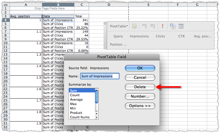
Now I want to see which of these positions drove the most clicks. I’m going to delete the Sum of Impressions and Sum of Position CTR fields. To do this, Click on the corresponding cell in the pivot table (B4) and then navigate to Field Settings and then click Delete.

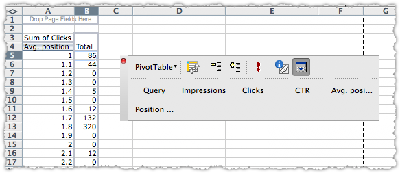
Do the same thing for both Sum of Impressions and Sum of Position CTR and you’re left with a table that shows the clicks by position.

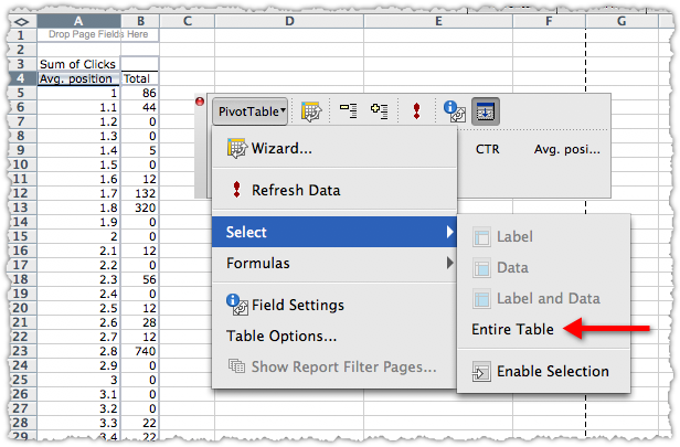
Now it’s time to make a chart. First you need to select the entire table by clicking the PivotTable button and using the Select menu to … select the Entire Table.

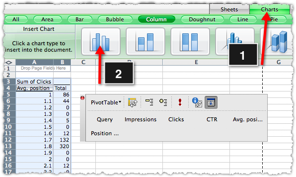
Now create a chart like you normally would.

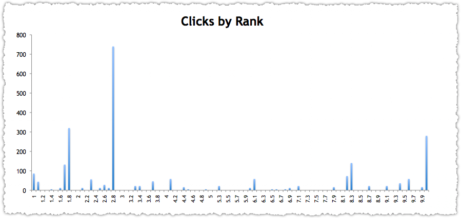
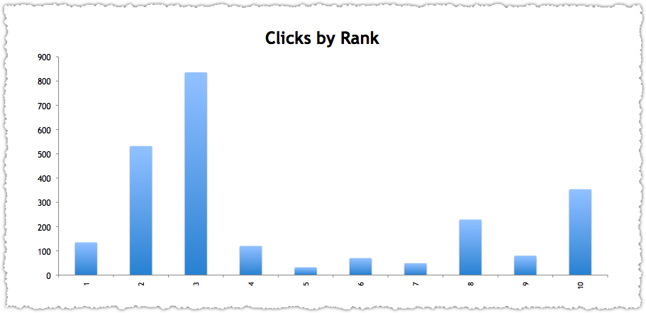
And after a bit of tweaking here and there you can produce a presentation quality chart.

In this instance you might be surprised to see where most of the clicks come from. It might make sense for me to review the terms at 2.8 and see if I could move them up a spot to grab a higher share of clicks.
Refreshing Pivot Table Data
Now for extra credit. I mentioned in my SEO Excel Functions post the need to round numbers. In this instance, perhaps I just want to see things by whole number rank.
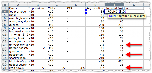
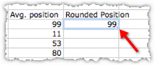
Lets go back to the actual data table and create a column next to Avg. Position. I’ll name it Rounded Position and then use the ROUND function to change it to a whole number.

Now I’ll copy that all the way down the column. To do this quickly just double click the small box in the lower right hand corner of that cell.

Now select the entire column starting below the title by using the shift-ctrl-down arrow. Then copy and paste values over the data in the Avg. position column. You’re basically overwriting the decimal rank data with whole number rank data.
Alternatively you could insert a column into your data table (between D and E so it’s inside the original table range) and then paste values (including the header row) into that new column. By doing this you aren’t overwriting data. Instead you’re going to add an additional field to your pivot table.
If you choose this route you’d have to swap the Avg. position with Rounded Position in your pivot table and go though the hide items process again. Either way, the idea is to refresh the data in a pivot table.
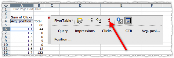
So lets go back to our pivot table sheet and click the exclamation point.

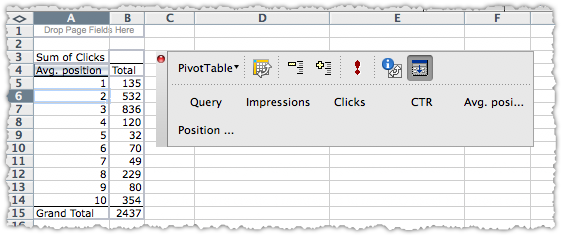
Voila! Now you’ve got a super easy to use table that shows clicks by whole number rank.

Every SEO likes a good chart, right? The chart data should have updated automatically too. So with a small tweak you can produce another one.

Amazingly enough there is more I could go through, but … I think that’s enough for now.
SEO Pivot Tables
If you’re doing SEO for any amount of time you’ll see the value of using a pivot table. They help you make sense of large sets of data, allowing you to accelerate your analysis and provide actionable insights. Hopefully this real data exercise was instructive and valuable. If it was, please give it a Sphinn.
Let me know if you have any questions, comments or pivot table tips and tricks of your own.


