You Are Browsing The eCommerce Category

Are Brands Good For Search?

April 11 2011 // eCommerce + SEO // Comments Off on Are Brands Good For Search?

Brands are becoming a greater part of search results. But is that a good thing?
Brands in Search

Brands are the solution, not the problem. Brands are how you sort out the cesspool.

That’s what then Google CEO Eric Schmidt said in October of 2008. In March of 2009 the Vince Change made good on that comment, giving brands an extra boost in search results. And today we talk about the rising prominence of brand signals in Google’s algorithm.

Brands, Comfort and Trust

Many claim that brands increase trust in search results. Users see something familiar and that conveys a level of trust. This might be true (though I think people may be conflating comfort with trust) but, more to the point, is it really what search is about?

Why do we search? Many definitions of search imply the act of locating something otherwise unknown or concealed from us. That certainly doesn’t apply to these brands.

Around The Internet Corner

A recent comment on this blog is what really got me thinking about how brands and search intersect.

If I wanted to buy something, I’d go straight to Amazon. I don’t need the top of half my Google searches to all be stores I can drive down the street to get to.

A number of years ago it was far more difficult to get from one point of the Internet to the other. Connection speeds were slower and tabbed browsing wasn’t as ubiquitous as it is today.

Search supplanted browsers as the fastest way to get from point A to point B. But today, not only are those stores ‘down the street’ they’re also just around the Internet corner. The next site is one ‘open a new tab’ click away.

Search may no longer be the fastest way to get from point A to point B.

Speedy Navigation

Search Speed and Navigation

I think Google has responded to this evolution. Google Instant can be viewed in a very different light if you think about whether search or the browser is the fastest way to get from place to place. Shaving off those seconds are tremendously important in ensuring that users continue to use Google to navigate the Internet.

What about navigation? Navigational searches are on the rise, and we seem to tacitly accept navigational search as a given part of the landscape. But why?

Why are we still using Google to search inventory of known sites and brands? We know how to get to these stores. Well … Google makes it easy, providing more and more pathways to brands and stores.

Google Related Brands and Stores

I think these implementations might also be teaching users that they could simply visit these sites directly. Right now inertia is on Google’s side, but for how much longer?

Better Brand Search

Browsers have a real opportunity to retake control of user navigation. Unfortunately, the human computer interface for browsers is dreadful.

Firefox Search Box

Could the search box dynamically change the search engine based on the query? Right now the user is forced to change this on a per query basis. And I’d bet selecting other search engines is a low single digit percentage activity.

Maybe a transactional search brings up the option to search your favorite stores, launching each in a separate tab? It could even be a separate window, creating a self-contained environment for you to shop your favorite stores for that product.

Perhaps as you visit eCommerce sites your browser prompts you to add that site to your personal mall. Then when you’re looking for a product, you simply enter it (in a different and well labeled field) and your personal mall is created.

This is but one off-the-cuff idea! There are so many other ways to tackle this problem that would eliminate the need for traditional search engines.

But who is going to do this? Mozilla has little incentive to innovate in this direction given their lucrative relationship with Google. Chrome? Not unless someone else did it first. That leaves Internet Explorer who have consistently shown a lack of vision and execution.

Another search engine? I do like what DuckDuckGo is doing, by automatically putting an Amazon search result at the top when it identifies a transactional query. But I’m not sure any upstart has the power to turn the tide without help from a browser.

Brands Hasten Search Demise

Why search Google if it’s just returning the same brands I already know and trust? Especially since I can get to those sites (quickly) without the annoying ads.

By placing more and more brands at the top of search results I feel like Google is hastening this realization. Users may begin to see the results as more comfortable and trusted but not more valuable.
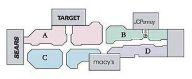
brand directory

Search is currently the infrastructure of the Internet mall. It’s how people ‘walk’ from one store to the other. Homogenized brand results may turn Google into a directory of the Internet mall. You might reference the directory once in a while when you’re stuck, but most of the time you’ll ‘walk’ from store to store on your own instead.
Retailers Slow To Adopt Like Button

February 09 2011 // eCommerce + SEO + Social Media // 4 Comments

In April 2010 Facebook launched the Open Graph and Like button, allowing sites to better control how their pages are displayed in Facebook News Feeds and search results.

Retailers Slow To Adopt Like Button

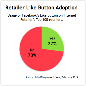
Yesterday I visited all of Internet Retailer’s Top 100 retailers to see if they were using the Like button. I did not include those who were using the Like button for their Facebook Page but instead was looking for Like button usage on product pages.

Adoption Rate of Facebook Like Button by Retailers

The adoption rate of the Like button for eCommerce seems low, with only 27% of the Top 100 online retailers using the Facebook Like button.

Like vs Share

Facebook Share was not included in the above numbers, but is more widely used by retailers. Yet, the share functionality is no longer promoted or recommended by Facebook. Searching for it on their developers platform results in very little and what does usually points to the Like button and Open Graph documentation.

While not specifically measured, I’m unsure if any of these retailers (even those with the Like button installed) were using the related social plugins. In particular, the Recommendations plugin could be an interesting cross sell feature for retailers.

Facebook Insights

Of those using the Like button, only 35% were tracking usage via Facebook Insights. My methodology for validating this was to use the Facebook Linter tool on a retailer’s domain. I counted those who had the appropriate Facebook Insights for Domains verification (fb:admins, fb:app_id or fb:page_id) enabled.

This is somewhat less surprising given the difficulty in verification, lack of robust data in Facebook Insights and ability of retailers to track downstream traffic from Facebook as a benchmark for success. However, this metric should be of concern to Facebook.

eCommerce Opportunity

Facebook Money

The Like button and Open Graph present a huge opportunity for retailers and eCommerce. Using Facebook SEO, retailers can optimize the way their products are presented on Facebook.

Each Like is a type of micro-review and an opportunity for retailers to leverage brand affinity. In addition, sites can publish stream updates to users who have Liked pages via the Open Graph API.

There are 500 million active users who spend 700 billion minutes a month on Facebook. When will retailers decide to dedicate more effort to reach this captive audience?

How To Deal With Email Mistakes

May 24 2009 // eCommerce + Humor + Marketing // Comments Off on How To Deal With Email Mistakes

I am subscribed to a lot of email newsletters. It’s one of the better ways to keep current with email marketing, allowing me to track send frequency, timing and other trends.

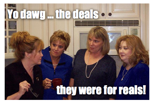
The other day I received an email from Smith & Hawken advertising their Memorial Day Deals. Four hours later I got another Smith & Hawken email with a subject line that read ‘Oops, we goofed: Memorial Day Deals for Reals’

Deals for Reals Email

Deals for Reals?

The phrase didn’t match my image of Smith & Hawken. Sure, reals wasn’t spelled with a ‘z’ but it still seemed off-brand. A quick peek at Quantcast confirmed my suspicion – Smith & Hawken customers are older, affluent, highly educated women.

Know your audience

I’m guessing most recipients thought it was a typo. To make matters worse, Smith & Hawken figured out (too late I suppose) that they could have changed the image served in the email to reflect the correct price. In fact, the once erroneous price is now displayed correctly in both email versions.

Smith & Hawken goofed three times. Once with an incorrect price in the email, again with sending an off-brand message and lastly for doing so hastily, before implementing a better solution.

Email Mistakes Happen

Run an email marketing program for any amount of time and you’re bound to make a mistake at some point. You’ll get that frantic call coupled with an avalanche of forwarded emails from colleagues. The price is wrong! The product is out of stock! There’s a typo! It doesn’t work in IE6! Trust me, I’ve been there.

Don’t Panic

Your first reaction might be to immediately fix the error and resend the email as quickly as possible. Once that train leaves the station it can be hard to stop. Unfortunately, the focus on speed often results in further errors and limits your ability to think more broadly.

Instead, come to terms with the mistake. Own up to it and move on. Don’t carry the burden of the mistake around like a scarlet letter. It taints your judgment.

How many?

How many people are really going to see this mistake? How big is your list? What’s the average open rate? Is the error on only one item out of many? Do the math and you might find out that it’s not as big a deal as you first thought.

However, if the mistake is egregious enough (major pricing error or humorous typo) you may have to account for additional views through viral and social mediums.

How big?

Will the mistake result in a loss? How big was the pricing error? Are you bound to honor that price? Is the typo going to damage your brand? In all cases the answer is usually no.

You could choose to honor a pricing error and reduce your margin, or simply build in some extra customer service cost in dealing with pricing complaints. Throw in a retention coupon for good measure and you might actually build brand equity instead of fritter it away.

Typos are annoying but probably aren’t going to damage your brand in the long run unless they become routine. I’ve been critical of typos from Abebooks because I saw a pattern of errors. That, and subject line errors are the easiest ones to catch. Yet, in retrospect, the typos probably don’t amount to much.

How to respond

In this case, I’d opt to do an image replacement and not resend the entire email. Odds are that customers aren’t going to zero in on the one mispriced item.

Those that click through before the image replacement is complete will see the pricing discrepancy but only a few are likely to contact customer service or make it a federal case. Others may mutter under their breath and grumble about the discrepancy but it probably won’t change their behavior.

To safeguard against the latter I’d create a list of those who clicked through on the mispriced item and send a mea culpa email with a coupon for their trouble. (If you don’t have this type of email template ready to go – you should.)

By doing so, I’m only speaking to those who saw the email, reducing my cost and not broadcasting an error to those who weren’t even aware of it in the first place.

Stop Email Mistakes

Don’t let my attitude make you think I’m okay with email errors. I’m not! You should do everything you can to ensure they don’t happen. Have a good process in place. Follow proper QA guidelines. Ensure others are looking at the email before it goes live. Proofread text by reading it backwards. If it is very important and very long, make use of Espresso Translations services agency. Be paranoid!

When mistakes do happen, take a deep breath, resolve the problem and learn from the experience.

For reals!

Call To Action Button Size and Color

February 08 2009 // eCommerce + Marketing + Web Design // 3 Comments

In December I said that testing your call to action should be at the top of your New Year’s resolution list.

On the Internet the call to action often takes the form of a button. So while words still matter, there are other dimensions to consider.

Thinking about the size, shape, color, and placement (among other characteristics), our findings indicate that future testing could reveal surprising – and positive findings – based on changes to the download button.

That’s an excerpt from a post (The Download Button Drives Downloads) on the Mozilla Blog of Metrics. By the way, they’re absolutely right.

Call To Action Button Size

Your call to action buttons should be big and obvious. If you abide by Five Foot Web Design principles you should have no problem seeing the call to action when you take a few steps back from your monitor. If you can’t see it, your users are likely to miss it as well.

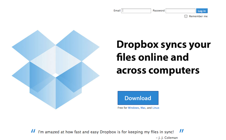
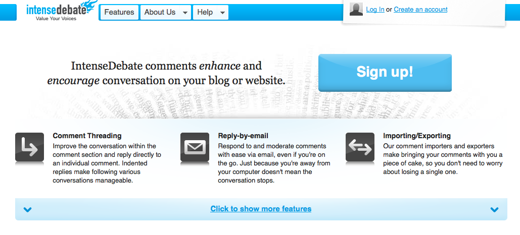
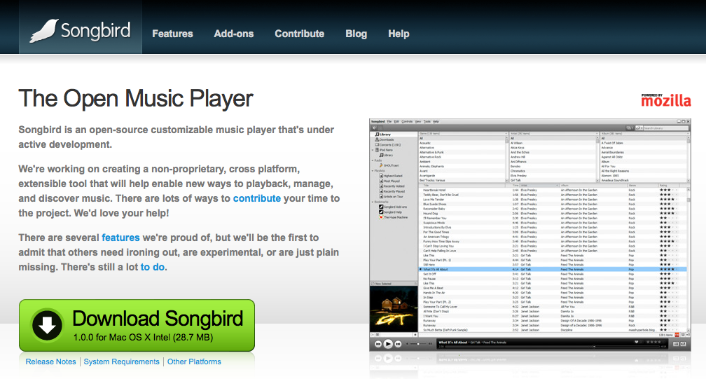
Here are a few examples of sites who got it right.

Dropbox

Dropbox Home Page

Intense Debate

Intense Debate Home Page

Songbird

Songbird Home Page

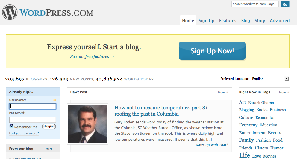
WordPress

Wordpress Home Page

Size can be relative based on the placement of the button and other design elements on the page. Your call to action button doesn’t always have to be huge but … you’re probably better off with it being bigger rather than smaller. (No jokes here please.)

Don’t be afraid to make your offer! Be confident. Not doing so is a subliminal sign to users that the product or offer isn’t valuable.

Call To Action Button Colors

Size is a relatively easy subject to tackle. The color of call to action buttons, on the other hand, is a hot topic. Jonathan Mendez (who you should be reading) touts the use of red in his 7 Rules for Landing Page Optimization.

Tell your brand team to go to hell and throw your styleguide out the window. Red buttons can by themselves raise your conversion rate. Green can be good as well but most times in our testing if color matters it is red that wins.

Not everyone agrees that red is the answer. And clearly none of the examples above took this advice to heart. Yet three out of four (Songbird being the outlier) have buttons that adhere to the site’s current styleguide and color palette. So who’s to say red wouldn’t provide a boost in conversion rate.

Why is color such a big deal?

Research reveals all human beings make a subconscious judgment about a person, environment, or item within 90 seconds of initial viewing and that between 62% and 90% of that assessment is based on color alone. [Institute for Color Research]

Each color is associated with different emotions and meanings. The ‘red’ debate revolves around whether the benefits of the color – passion, desire, excitement – outweigh the drawbacks – anger, danger and debt.

Red should be used sparingly, so as not to overwhelm users, and should also be first on your list of colors to test on your call to action button.

Lets face it. The speed of our society has accelerated and time is perhaps our most guarded resource. A site has a very short window to capture, retain and direct a user. So red doesn’t sound like a bad idea. In fact, any contrasting color might do the trick.

Ogilvy on Advertising

Less talked about is the color of the text on the call to action button.

David Ogilvy, often called the Father of Advertising, made black text famous in his book Ogilvy on Advertising. (Yes, the man practiced what he preached.)

Yet the overwhelming number of call to action buttons use white text on a colored background. Ogilvy would certainly have thrown a fit if he saw white text on black.

Three out of the four examples above (Songbird being the outlier again) use reversed out text. Is that a lost opportunity?

Don’t forget to try a black text version when testing your call to action button.

You’ve got nothing to lose and everything to gain by testing the words, size and color of your call to action buttons. It is one of the easiest things you can do to improve your business.

eCommerce and RSS

January 11 2009 // eCommerce + Marketing + Technology // 1 Comment

Are eCommerce sites overlooking RSS?

RSS still hasn’t hit the mainstream, but could eCommerce sites help drive RSS adoption and at the same time increase the effectiveness and reduce the costs of their communications with customers? Yes!

Too many eCommerce sites seem to believe that the only place for RSS exists if they have their own blog. And lets face it, many don’t have the bandwidth to produce a decent blog. It’s a resource drain and one that many find hard to explain during budget meetings.

Yet, most eCommerce sites already have blogs, they just don’t know it. They’re called newsletters. So the time and effort argument is irrelevant.

Why push newsletters via RSS?

Most eCommerce sites use email as their primary method of communication. Yet, email has three big (and growing) drawbacks: deliverability, over saturation and cost.

Deliverability issues persist as email finds its way into spam folders or bounces due to changed email addresses. A 2007 Internet Retailer survey indicated that only 40% of respondents experienced 90%+ deliverability. And a 2008 Return Path report showed commercial deliverability at 88%.

Just like the old direct mail world, people move … a lot. Here’s the data from Jupiter Research (2008) and Return Path (2007) respectively.

17% of Americans create a new email address every 6 months

30% of subscribers change email addresses annually

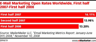
Part of the deliverability problem is over saturation. Email marketers have overused the medium, flooding mailboxes to the point where users feel overwhelmed. The result has been a steady decline in open rates, from nearly 40% in 2003 to 13% in 2008.

eMarketer Email Marketing Open Rates 2007-2008

Many eCommerce sites have increased the frequency of email to respond to declining open rates. The open rate might be low on each email but if you send six emails a month your total open rate might wind up being pretty good.

Yet, there is incremental cost associated with this increased volume. Not only that but it contributes to the over saturation problem which negatively impacts open rate and effectiveness. It’s a vicious and costly cycle in which eCommerce sites wind up paying more for less.

The advantages of RSS

RSS solves most, if not all, of the deliverability problem. There is no spam filter or black list. I’d also argue that you’re less likely to switch readers than email addresses, thus reducing the churn rate of your subscriber base.

Email has become unncessarily intrusive and ephemeral. An email will be pushed ‘below the fold’ of a person’s inbox with greater speed as the volume of email a person receives increases. The adage ‘out of sight, out of mind’ is apt in this instance.

Over saturation might be an issue in RSS but the format is a more ‘on demand’ type of solution. TV networks are starting to understand this, that forcing people to watch their show at 8pm on Thursday might not be optimal. Similarly, RSS allows subscribers to engage with your content on their own terms.

Subscribers will still get an inbound notification that new content has arrived, so you’ll still see an immediate (though perhaps less pronounced) traffic surge. And the content will have a longer life due to increased delivery and visibility in the reader.

Did I mention RSS would be radically cheaper than email? Leaps and bounds cheaper really.

But didn’t eCommerce already try RSS?

Yes and no. When RSS first arrived on the scene there was a big ruckus about how RSS could replace email. The problem was marketers didn’t have a clue how to really make that happen. Most didn’t even use RSS and found it confusing at best.

I speak from experience. I was smack dab in the middle of it all as Director of Marketing at Alibris. I sensed that it had potential but I didn’t fully grok RSS until later on, after I’d left the eCommerce space.

The topic was a blip on the radar at conferences and no one really wanted to upset the applecart. Email was a solid performer and search was the shiny new channel.

So any attempts made in those years were premature and uninformed for the most part.

Why could RSS succeed this time?

If eCommerce sites began to understand that RSS could help them achieve their goals they could be a force of change for the technology. RSS needs to be relaunched, rebranded or both. Who better to do that then those in the business of selling.

In addition, the reader market has matured and stabilized. I see no reason why Google wouldn’t want to partner with major retailers and offer their customers an easy (perhaps cobranded) way to start using RSS using Google Reader.

Finally, RSS can be used more creatively by eCommerce sites. In a tough economy, why not let users select products and create a price watch feed? Or let users subscribe to reviews of a product to help them through the sales cycle?

Email versus RSS

email vs rss

The revenue stream from email has obscured the growing cost of the channel. I don’t know of a single eCommerce retailer who really ‘likes’ their email service provider. The time and money dedicated to producing and sending email seems to grow and not shrink.

Yet, instead of looking at new ways to communicate with customers many simply look to ‘fix’ email or find another service provider. Deliverability in particular has given rise to a number of new businesses. That should be a clear signal for change.

I’m not saying eCommerce should abandon email, but the ones who figure out RSS will have a marked advantage.

xxx-bondage.com