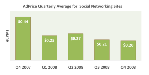
Social media sites like Digg, MySpace, Facebook and others are finding it difficult (to say the least) to get by using an advertising based revenue model. A drum beat of research shows that users don’t like the ads on these venues or simply don’t see them. The poor performance of these social ads translates into dreary CPM ad rates.
Social Advertising
The Q4 2008 Pubmatic AdPrice Index (pdf) puts Social Networking sites at the bottom of all other verticals and the trend for Social Networking sites continues to slide.

Many of these social sites have incredible engagement metrics. Users are there every day, multiple times a day and stay there for – sometimes – hours on end. You might think this would be a huge boon for potential advertisers. Yet, the exact opposite seems to be the case.
The Participatory Marketing Network (PMN) conducted a Generation Y study that detailed why “advertising remains a tough sell in these environments.”
84 percent noticed ads on social networks, 74 percent say they click infrequently/never (36 percent saying they don’t click on ads at all).
Then there’s a recent Nielsen study (pdf) of social networking users which showed that ‘false’ was the term most closely associated with ‘advertising’. Yeah … that’s not a good sign.
The high engagement on these sites means users become intimately aware of the structure of the site. They understand exactly where to look, how to navigate and what links to click.
The impetus for their visit compounds the problem. It is usually, and not surprisingly, social. Firing back responses to comments on your high school yearbook photo just isn’t the best advertising opportunity.
So while users may ‘notice’ ads I’m not sure they’re really ‘seeing’ them. They know where they are but they’re avoiding the advertising and they’re getting better and better at doing it.
Rearrange The Furniture

What if you made the navigation or design different. Not a major redesign but an ongoing number of smaller, incremental changes that break a user’s rote click pattern. Keep them on their toes!
Think of it as rearranging the furniture in a room. You’d still be able to find the couch, the coffee table, the chair and the TV, but it would all be just a little different. They’re in slightly different places or they’ve been reupholstered.
Wouldn’t that make you take stock of the entire room again? To get your bearings you’d see things you might have missed before. That picture on the wall that you hadn’t really looked at in ages?
Inconsistent Design
I’m not recommending something like this for just any site, but it makes sense for social sites where users become habituated to the design through repeated use. In these instances rearranging the furniture every month might help them see the paintings (aka banners) on the wall.
Is Facebook is seeing an increase in CTR since their much maligned redesign? Sure, 94% of users might be giving it a thumbs down but they’re looking at it with ‘new’ eyes. (Contact me if you had a campaign running during the redesign.)
A substantial redesign, nevermind the ruckus, wouldn’t scale well. Instead I’m thinking of smaller changes. It could be as big as moving columns or the order of top navigation or as small as a color change or resizing the logo.
The idea sounds radical even as I suggest it, but traditional techniques are not working. We take regular navigation off of lead generation and cart pages. Sure, that has more to do with keeping the user focused on a task, but it’s still a break in the natural design of the site.
Advertisers, by in large, still don’t understand how to market on social sites. I’m not sure any of us really know what’s going to work or not. So why not test inconsistent design, even if it’s a transitional measure?
The Next Post: Social Marketers Need to Build an Ice Cream Truck
The Previous Post: Google Cache Crawl 404 Errors

Comments Down Here
// I Accept Wit, Insight, Disagreement, and American Express.
Sorry, comments for this entry are closed at this time.
You can follow any responses to this entry via its RSS comments feed.