In April, the Internet breathed a sigh of relief when Delicious was sold to AVOS instead of being shut down by Yahoo. In spite of Yahoo’s years of neglect, Delicious maintained a powerful place in the Internet ecosystem and remained a popular service.
Users were eager to see Delicious improve under new management. Unfortunately the direction and actions taken by Delicious over the last 8 months make me pine for the days when it was the toy thrown in the corner by Yahoo!
Where Did Delicious Go Wrong?
![]()
I know new management means well and have likely poured a lot of time and effort into this enterprise. But I see problems in strategy, tactics and execution that have completely undermined user trust and loyalty.
Bookmarklets
The one mission critical feature which fuels the entire enterprise falls into disrepair. Seriously? This is unacceptable. The bookmarklets that allow users to bookmark and tag links were broken for long stretches of time and continue to be rickety and unreliable. This lack of support is akin to disrespect of Delicious users.
Stacks
Here’s how they work. Select some related links, plug them into a stack and watch the magic happen. You can customize your stack by choosing images to feature, and by adding a title, description and comment for each link. Then publish the stack to share it with the world. If you come across another stack you like, follow it to easily find it again and catch any updates.
Instead of the nearly frictionless interaction we’ve grown accustomed to, we’re now asked to perform additional and duplicative work. I’ve already created ‘stacks’ by bookmarking links with appropriate tags. Want to see a stack of links about SEO, look at my bookmarks that are tagged SEO. It doesn’t get much more simple than that.
Not only have they introduced complexity into a simple process, they’ve perverted the reason for bookmarking links. The beauty of Delicious was that you were ‘curating’ without trying. You simply saved links by tags and then one day you figured out that you had a deep reservoir of knowledge on a number of topics.
Stacks does the opposite and invites you to think about curation. I’d argue this creates substantial bias, invites spam and is more aligned with the dreck produced by Squidoo.
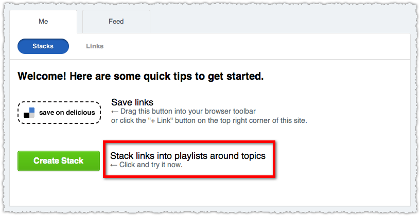
Here’s another sign that you’ve introduced unneeded complexity into a product.

In just one sentence they reference stacks, links, playlists and topics. They haven’t even mentioned tags! Am I creating stacks or playlists? If I’m a complete novice do I understand what ‘stack links’ even means?
Even if I do understand this, why do I want to do extra work that Delicious should be doing for me?
Design

The visual makeover doesn’t add anything to the platform. Do pretty pictures and flashy interactions really help me discover content? Were Delicious users saying they would use the service more if only it looked prettier? I can’t believe that’s true. Delicious had the same UI for years and yet continued to be a popular service.
Delicious is a utilitarian product. It’s about saving, retrieving and finding information.
Sure, Flipboard is really cool but just because a current design pattern is in vogue doesn’t mean it should be applied to every site.
UX
There are a number of UX issues that bother me but I’ll highlight the three that have produced the most ire. The drop down is poorly aligned causing unnecessary frustration.

More than a few times I’ve gone across to to click on one of the drop down links only to have it disappear before I could finish the interaction.
The iconography is non-intuitive and doesn’t even have appropriate hover text to describe the action.
![]()
![]()
Does the + sign mean bookmark that link? What’s the arrow? Is that a pencil?
Now, I actually get the iconography. But that’s the problem! I’m an Internet savvy user, yet the new design seems targeted at a more mainstream user. Imagine if Pinterest didn’t have the word ‘repin’ next to their double thumbtack icon?
Finally, the current bookmarklet supports the tag complete function. You begin typing in a tag and you can simply select from a list of prior tags. This is a great timesaver. It even creates a handy space at the end so you can start your next tag. Or does it?

WTF!? Why is my tag all muddled together?
Delicious improved tagging by allowing spaces in tags. That means that all tags have to be separated by commas. I get that. It’s not the worst idea either. But the tag complete feature should support this new structure. Because it looks like it functions correctly by inserting a space after the tag. I mean, am I supposed to use the tag complete feature and then actually backspace and add a comma?
It’s not the best idea to make your users feel stupid.
Uptime

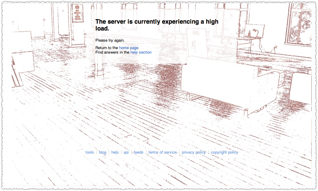
The service has been unstable, lately as poor as it was at the height of Twitter’s fail whale problem. I’ve seen that empty loft way too much.
What Should Delicious Do Instead?
It’s easy to bitch but what could Delicious have done instead? Here’s what I think they should have (and still could) do.
Filtering
An easy first step to improve Delicious would be to provide a better way to filter bookmarks. The only real way to do so right now is by adding additional tags. It would have been easy to introduce time (date) and popularity (number of times bookmarked) facets.
They could have gone an extra step and offered the ability to group bookmarks by source. This would let me see the number of bookmarks I have by site by tag. How many times have I bookmarked a Search Engine Land article about SEO? Not only would this be interesting, it maps to how we think and remember. You’ll hear people say something like: “It was that piece on management I read on Harvard Business Review.”
There are a tremendous number of ways that the new team could have simply enhanced the current functionality to deliver added value to users.
Recommendations

Delicious could create recommendations based on current bookmark behavior and tag interest. The data is there. It just needs to be unlocked.
It would be relatively straightforward to create a ‘people who bookmarked this also bookmarked’ feature. Even better if it only displayed those I haven’t already bookmarked. That’s content discovery.
This could be extended to natural browse by tag behavior. A list of popular bookmarks with that tag but not in my bookmarks would be pretty handy.
Delicious could also alert you when it saw a new bookmark from a popular tag within your bookmarks. This would give me a quick way to see what was ‘hot’ for topics I cared about.
Recommendations would put Delicious in competition with services like Summify, KnowAboutIt, XYDO and Percolate. It’s a crowded space but Delicious is sitting on a huge advantage with the massive amount of data at their disposal.
Automated Stacks
Instead of introducing unnecessary friction Delicious could create stacks algorthmically using tags. This could be personal (your own curated topics) or across the entire platform. Again, why Delicious is asking me to do something that they can and should do is a mystery to me.
Also, the argument that people could select from multiple tags to create more robust stacks doesn’t hold much water. Delicious knows which tags appear together most often and on what bookmarks. Automated stacks could pull from multiple tags.
The algorithm that creates these stacks would also constantly evolve. They would be dynamic and not prone to decay. New bookmarks would be added and bookmarks that weren’t useful (based on age, lack of clicks or additional bookmarks) would be dropped.
Delicious already solved the difficult human element of curation. It just never applied appropriate algorithms to harness that incredible asset.
Social Graph Data
Delicious could help order bookmarks and augment recommendations by adding social graph data. The easiest thing to do would be to determine the number of Likes, Tweets and +1s each bookmark received. This might simply mirror bookmark popularity though. So you would next look at who saved the bookmarks and map their social profiles to determine authority and influence. Now you could order bookmarks that were saved by thought leaders in any vertical.
A step further, Delicious could look at the comments on a bookmarked piece of content. This could be used as a signal in itself based on the number of comments, could be mined to determine sentiment or could provide another vector for social data.
Trunk.ly was closing in on this since they already aggregated links via social profiles. Give them your Twitter account and they collect and save what you Tweet. This frictionless mechanism had some drawbacks but it showed a lot of promise. Unfortunately Trunk.ly was recently purchased by Delicious. Maybe some of the promise will show up on Delicious but the philosophy behind stacks seems to be in direct conflict with how Trunk.ly functioned.
Analytics
Delicious could have provided analytics to individuals as to the number of times their bookmarks were viewed, clicked or re-bookmarked. The latter two metrics could also be used to construct an internal influence metric. If I bookmark something because I saw your bookmark, that’s essentially on par with a retweet.
For businesses, Delicious could aggregate all the bookmarks for that domain (or domains), providing statistics on the most bookmarked pieces as well as when they are viewed and clicked. A notification service when your content is bookmarked would also be low-hanging fruit.
Search
Delicious already has search and many use it extensively to find hidden gems from both the past and present. But search could be made far better. In the end Delicious could have made a play for being the largest and best curated search engine. I might be biased because of my interest in search but this just seems like a no-brainer.
Revenue
Building a PPC platform seems like a good fit if you decide to make search a primary feature of the site. It could even work (to a lesser extent) if you don’t feature search. Advertisers could pay per keyword search or tag search. I doubt this would disrupt user behavior since users are used to this design pattern thanks to Google.
Delicious could even implement something similar to StumbleUpon, allowing advertisers to buy ‘bookmark recommendations’. This type of targeted exposure would be highly valuable (to users and advertisers) and the number of bookmarks could provide long-term traffic and benefits. Success might be measured in a new bookmarks per impression metric.
TL;DR
The new Delicious is a step backward, abandoning simplicity and neglecting mechanisms that build replenishing value. Instead management has introduced complexity and friction while concentrating on cosmetics. The end result is far worse than the neglect Delicious suffered at the hands of Yahoo.
The Next Post: 2012 Internet, SEO and Technology Predictions
The Previous Post: Author Stats

2 trackbacks/pingbacks
Comments About Delicious Turns Sour
// 6 comments so far.
Tom Howlett // December 19th 2011
Great write-up, and suggestions on how to better Delicious.
I remember manually bookmarking web pages using Firefox’s built in bookmarking features until I discovered Delicious. Once I migrated to using it, I thought it was amazing, really useful for bookmarking the increasing number of pages/websites that I want to save for various reasons.
I was pretty dissapointed when the tagging feature stopped working. Being able to view and select tags that people already were using was a great timesaver. Is that feature gone? Otherwise I may be using a version which is a little bit out of date.
I really like your suggestions on grouping bookmarks by site and type, and organising through popularity with them utilising various metrics they should have access to. I for one haven’t had the time to look at Stacks in more detail, they are something I like the idea of, but it just seems like something that will take up more time and effort without offering me much.
I still use Delicious though, based on how much I liked it before. I hesitate to move platforms purely because I for one don’t want to use a platform completely new to me, I don’t want to loose any current bookmarks and the tags associated with them and I don’t see why they would choose to limit the functionality it had before (so I figure I will stick around).
I now use Instapaper for more recent stuff. Stuff that I am likely to read once and leave. It would be nice if Delicious had this kind of functionality as well, a dashboard similar to it perhaps?
I’m waffling now, but all I really wanted to say is that I want to stay with them. So the improvements you mentioned would be great.
AJ Kohn // December 23rd 2011
Thanks for your kind comments Tom.
I too haven’t abandoned Delicious yet. I wrote this, in part, because I have gotten so much out of Delicious for so many years and would prefer not to find another solution.
I believe the tagging feature does now work but it has been spotty and the updates have not been automatic nor communicated. So you have to disable or uninstall the old plug-in or extension and then fire up the new one instead.
Stacks is just work that results in little to no value. Skip it is my recommendation. It would be nice if they course-corrected and implemented some of my suggestions but I’m not holding my breath. I’m hanging on right now but I fear i’ll be looking for a replacement in 2012.
Bill at FamZoo // December 20th 2011
Your comments and suggestions are spot on. I hope the Delicious team reads your post, responds, and heeds your key points. It’s been so frustrating as a long time Delicious user to see even the most basic capabilities flail. Still hoping it’s just transition pains, but patience is withering…
AJ Kohn // December 23rd 2011
Thank you Bill. I’m glad I’m not alone in my frustrations. I’ve loved Delicious for so long and didn’t even really mind when it went neglected. It was just a solid piece of functionality that worked.
Like you, I’m hoping that these are just transition issues and that they’ll find their way but … the strategy and direction don’t bode well and 8 months is a long time on the Internet. I’m still rooting for Delicious but I’m not confident they’ll get there.
Brian Flores - SEO // December 22nd 2011
Nice post AJ and timely! I recently stopped signing onto delicious and bookmarking interesting posts because the new version really made it difficult to sign on. I liked the simplicity of the past and wished they never changed it. That’s not to say that I’m an opponent of change, just change in the wrong direction.
AJ Kohn // December 23rd 2011
Thanks Brian. And yes, I’m all for change but not just for the sake of changing. Delicious had nearly perfected their core product and functionality. Why AVOS decided to muck with that is a strange choice.
Disrupting the patterns of a large and loyal user base was a colossal misstep and simply unacceptable.
Sorry, comments for this entry are closed at this time.
You can follow any responses to this entry via its RSS comments feed.