Google has recently been trying to streamline search results as the number of universal search elements grows. It’s what Marissa Mayer, VP of Search Products and User Experience, calls ‘user interface jazz’.
Solving Google’s Jazz Problem
Recent attempts to solve the jazz problem have revolved – primarily – around a left contextual navigation pane. Whether it is always exposed or only introduced when clicked, Google seems sure that this is the way to solve search overload.
But is it really?
Google and Web 2.0
Google is rooted firmly in Web 1.0. There’s (clearly) nothing wrong about that. Yet, the interface hasn’t changed all that much as the web has evolved. While Mayer acknowledges the bimodal world of screen sizes (larger desktop screens but smaller mobile interfaces), does the interface fully acknowledge and take advantage of these advancements?
The Splinternet is real and seems only to be expanding with the launch of the iPad.
New User Interfaces
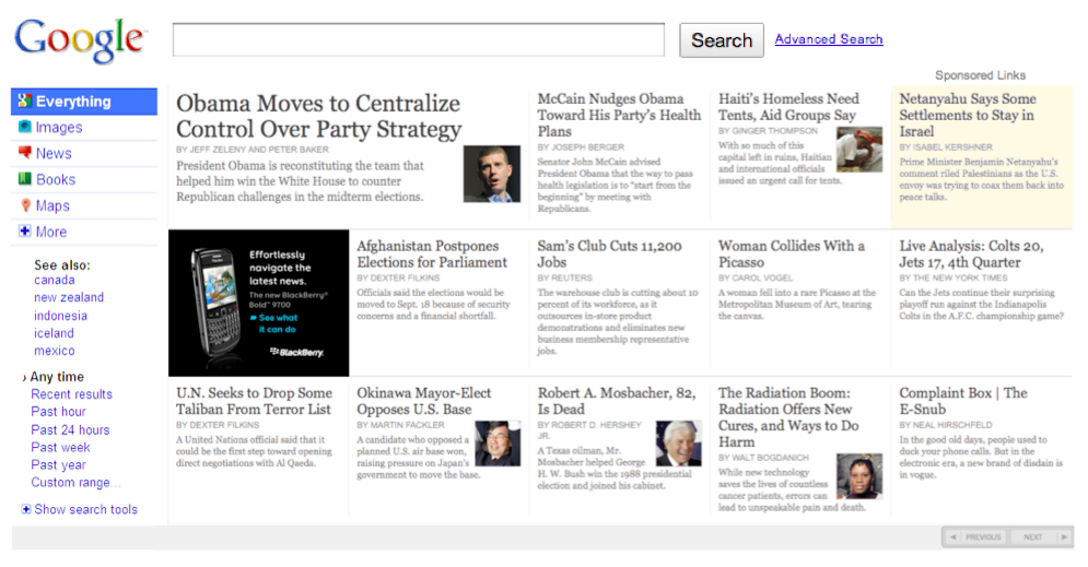
Some of the most interesting new interfaces are far more visual and horizontal in nature, allowing the user to digest more information at a glance. Think about what Google search results could look like if they used an interface like Lazyfeed or the Times Skimmer.
Google 2.0
Here’s a quick Frankenstein of what Google 2.0 could look like using a bit of Google’s Jazz UI and the Times Skimmer.

One or all of these results or panes could update in real-time. Another could present a fully embedded video. Yet another could present thumbnails for image matches. The possibilities, while not endless, are numerous.
I’ve kept the left hand navigation, but you could just as easily do without it. In fact, that would better adhere to Google’s search motto: don’t make the user do something we can do for them.
Google Takes The Safe Route?
Of course, Google would need to determine how to present AdWords effectively in this environment. Perhaps the fear of disrupting AdWords revenue is why a major UI change isn’t in the cards. But this seems like a contradiction in how Google sets goals and measures success.
Achieving 65% of the impossible is better than 100% of the ordinary – Setting impossible goals and achieving part of them sets you on a completely different path than the safe route. Sometimes you can achieve the impossible in a quarter, but even when you don’t, you are on a fast track to achieving it soon. Measuring success every quarter allows for mid course corrections and setting higher goals for the next quarter.
Maybe Google has already tested radical new UI with unsatisfactory results. Or maybe Google is taking the safe route, thinking that the search interface can remain relatively static as the web transforms.
Is Google really doing enough to solve user interface jazz?
The Next Post: Google Caffeine Is Not An Algorithm Change
The Previous Post: How To See Google Analytics Traffic Faster

1 trackbacks/pingbacks
Sorry, comments for this entry are closed at this time.
You can follow any responses to this entry via its RSS comments feed.