Content marketing is the hot new thing in the wake of Google’s animal themed algorithm updates. Marketers are doubling down on content. Yet, the majority of content on the web is not optimized for readability.
It’s not just what you say, it’s how you present it.
What Is Readability?
There are a lot of definitions of readability, some of which stir up a fair amount of debate. My version is aligned with Steve Krug’s Don’t Make Me Think, Giles Colborne’s Simple and Usable, the legacy of David Ogilvy and the research of Jakob Nielsen.
Readability is about making your content accessible and comfortable. Never make it a chore.
Readability Improves SEO

If you make your content difficult to read the value of that content goes down. Lack of readability frustrates comprehension and reduces sharing. This, in turn, limits the social echo of your content and lowers the chances of it obtaining organic links.
In short, readability is a valuable but overlooked part of SEO. Here’s my guide to producing readable content.
People Don’t Read, They Scan
The first thing you have to come to grips with is that people are not reading every word. Study after study after study shows that people scan instead of read.
On the average Web page, users have time to read at most 28% of the words during an average visit; 20% is more likely.
That doesn’t mean you should skimp on good writing. Instead, you just need to structure your content with scanning in mind.
Use A Font Hierarchy
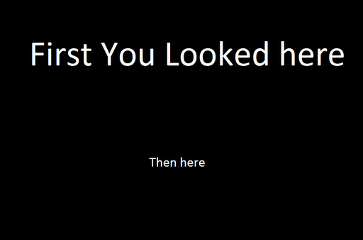
One of the better ways to meet that scanning behavior is to use a font hierarchy. Too often I see people using the same font size for their subheads, thinking that a simple bold is going to make the difference. It doesn’t.
If you look back through this blog you’ll see how I figured this out over time. Older posts don’t use a proper font hierarchy and that makes them more difficult to read.
There are some guidelines on the proper ratio for your font hierarchy, but there are so many variables, from the font you’re using to the length of the piece to name just a few. My advice is to use five foot web design to make sure you can read your subheads from a distance. Sometimes I just read my subheads to see if they tell enough of the story by themselves.
I’ve settled on using 14px for body text with a 24px subhead and always want the subheads to be in one line.
Subheads Are Your Friends
The key is to allow people to see the sections of your post at a glance. Make your subheads large enough and descriptive enough so readers can determine whether they’ll actually take the time to read that section word for word.
Use subheads as an advertisement to that section of content.
Subheads are also a great way to logically outline your content. What are the different points and aspects of the topic you’re covering? Most of my blog posts (including this one) start as an outline, which is an asset to creating content that communicates and engages.
Legibility Matters
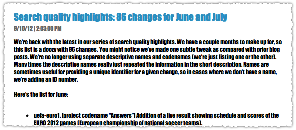
Of course you need to use a font face that is legible. Above, I’ve used Chrome’s Developer Tools to change the font on a recent Google blog post to Impact instead of Arial. Impact works on LOLcats when it’s large white text with a black border on a photo background, but using Impact as your body text font? LOL!
There’s a interesting study that shows that the ability to retain information improves when you use unusual fonts. The problem is that people would abandon that content altogether if they weren’t in a controlled setting.
I like (and use) a nice san serif font like Helvetica. But don’t get hung up on the serif versus san serif argument. Research conducted by Alex Poole indicates that it’s likely a matter of personal preference.
So if you like Georgia or Times New Roman, go for it. Sure, there have been some studies that show different fonts produce different reading speeds, but I wouldn’t obsess over it.
Get Line Height Just Right
Legibility is actually the most straight forward part of the equation. Readability is composed of a combination of factors that include the font, size, line height (leading), character spacing (kerning), content width and other typographic variables.
One of the bigger components is line height. Lets look at the same content using different line heights.

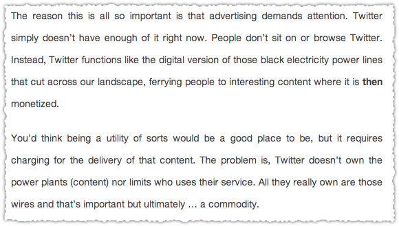
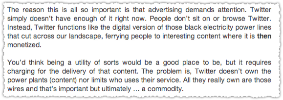
The first is too tight, the second too loose. They both frustrate easy reading. I think the line height I use (the third one) is decent. However, I found the golden ratio argument and calculator to be pretty compelling. So maybe I’ll increase my line height slightly.
Color Contrast

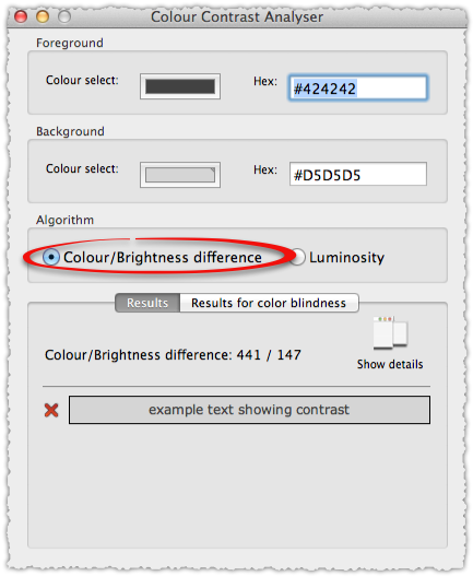
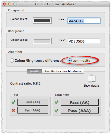
If you haven’t noticed I’m a big fan of black text on a white background. I’m in the Ogilvy camp on this one. Not only that but I see far too many people using colored fonts with some sort of colored background. Maybe the color palette is yellow and purple but there’s no good reason to have yellow type of a gray background. It’s difficult to read.
Don’t let a style guide get in the way of readability.
I’d rather go with the easy black on white. But if you’re going to start futzing with colors I recommend that you download and use this Contrast Analyzer tool to ensure it passes all of the various color tests.
Highlight The Important Stuff
You want your readers to walk away from your content having learned or at least remembered something, right? Make it easy for readers to find the important stuff by highlighting those points. This could mean bolding those sentences or, you know, actually highlighting them.
The goal is to make sure that the memorable stuff jumps out to the reader.
Use Short Paragraphs

There are studies on this but, isn’t this just common sense? Huge chunks of text are an instant turn-off to readers. For instance, why do you think there are only a few people in the SEO community who read patents? Those things have massive soul-crushing chunks of text that make your eyes cross.
Remember, you’re not reading Jonathan Franzen, that’s a different type of reading. Context is important.
In general, I keep my paragraphs to three to four sentences at most. And I’m never afraid to use one sentence paragraphs if I think it’s an important point I want to get across to readers.
I’m sure many of you might be thinking that long paragraphs are just fine. The right people will read it, the one’s who appreciate the fine art of writing, right? Wrong!
It’s not only your job to write well, but write in a way that is accessible.
Crush Pronouns
When you’re writing, you’re doing so within a mental flow. You’re making a logical argument and linking concepts in prior sentences and paragraphs with those in the current one. But what happens to the reader who is scanning that text? If they haven’t read the paragraph above word for word (or even at all), then those pesky pronouns are completely useless to the reader.
Now, I’m not saying you should remove all pronouns but I do recommend that you go back after you’ve completed your piece and replace those that make sense.
But isn’t that going to make the content stilted? In a word, no.
Using nouns is a more accurate description of your content. You’re creating sign posts for your readers so they know exactly what they’re reading at all times.
Nouns help users and search engines better understand what your content is about.
I also believe in a type of visual osmosis. At a glance you’re able to digest a whole lot of what is on the page without actually reading it. It might be why it’s so difficult for computers to emulate the human evaluation of pages.
Remember too that when you are truly reading, those nouns are visual short codes. You’re not really reading the name of a character in say, Harry Potter, every single time they’re mentioned right? Nouns are a way for you to understand context.
Use Images
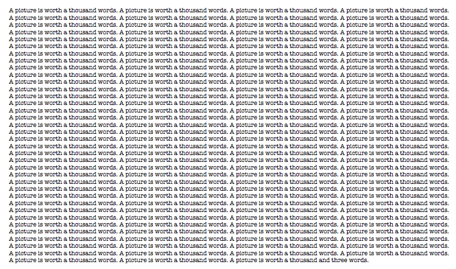
The web is getting more and more visual. Take advantage of that by using images to break up the flow of your content. Not only that, but you can use images to augment the text. You can tell a story or a joke with that image or make a connection for readers that they might not have made through the text.
Do not let me catch you writing content without at least one image. I mean it!
In addition to all of the benefits it has within the content it’s also vital to ensuring that your content is portable. If you’re lucky enough to have your content shared on social networks you must optimize for appearance. Because people scan (yup, again) their news feeds.
If your content doesn’t have a good image, or has a default image like a magnifying glass (I’m looking at you Google) or RSS icon, then the odds of that content being seen, read and shared go down precipitously.
Reduce Clutter
If you work in advertising or design for any amount of time you’ll hear people refer to white space. It’s that part of the page that is left untouched so that the remaining content can breath and shine.
Many websites try to cram as much as they can onto the page leaving very little white space. In fact, the Readability app is a reaction to these overly cluttered environments.
Your banner ad, your timed pop-up, your premium newsletter sign up, your Hello bar, your Greet Box, your social icons and a whole host of others might be distracting users from getting value from your content.
Link Your Paragraphs

I had an English teacher in high school who I absolutely hated. His name was Dr. Flynn. He was a tall, ill-tempered man who would bark out his lessons and become red-faced with rage at our incompetence and insolence.
I remember one week where we had to bring in a topic sentence every day. Each of us had to read our that sentence out loud at the beginning of class.
“Wrong!”
“Wrong!”
“Good!”
“Wrong!”
This was just about getting the topic sentence right, never mind how the first paragraph should detail all of the points you’d cover in the following paragraphs.
But what stuck with me most was the idea that the last sentence in a paragraph should be linked to the first sentence in the next paragraph. There was order and logic to how you constructed a paper or essay.
When I got to college I realized that Dr. Flynn had done me a huge favor. Because a lot of my classmates were clueless. When I mentioned some of the lessons he’d drilled into me, I’d get vacant stares in return. To this day I am still thankful for Dr. Flynn’s lessons.
So whether you call it story telling or creating a logical flow, make sure that you’re linking your paragraphs and sections so that it makes sense to the reader.
Reading Difficulty
Of course there’s also how you write. There are a number of different ways that you can assess the difficulty of a piece of content. How many words are in each sentence? How many syllables are in each word? How many sentences in each paragraph? On and on and on.
There are a number of tests to help assess the reading level of your content. Cloze, Flesch-Kincaid, Gunning Fog, Coleman Liau, SMOG and others can all be used to determine an objective reading difficulty. Arienne Holland put together a good list of online readability tools on the Raven Blog.
Your writing should be focused and concise. Now, I don’t always follow this advice. Many of my blog posts are a bit long and I do indulge in some word play from time to time.
I tend to believe that my personality comes through via my writing and it’s that type of authenticity that is compelling to readers. However, I do edit myself quite a bit, chopping whole chunks of text that, while enjoyable to have written, are superflous in nature.
And I rely heavily on other forms of readability to make up for this deficiency. So, do as I say, not as I do in this instance.
TL;DR
Readability is an overlooked part of SEO. Those who embrace readability will have a leg up as content marketing becomes more and more important. Because great content isn’t great unless it gets read.
(Thanks to Micah France for introducing me to Simple and Usable and to Rand Fishkin for inspiration.)
The Next Post: US Desktop Search Volume Declines
The Previous Post: The Future of Twitter is Twumblr

35 trackbacks/pingbacks
Comments About Readability and SEO
// 65 comments so far.
Ryan McLaughlin // August 13th 2012
AJ you killed it again. This is a great post. Thanks.
AJ Kohn // August 13th 2012
Thank you Ryan. I’m glad you liked it and hope it helps others learn what I did the hard way.
Max Minzer // August 13th 2012
This is a post that people need to read, not scan.
So many tips and reminders. So many useful resources.
I like your style – totally readable 😉
AJ Kohn // August 13th 2012
Thanks Max. While I hope people will read it, I’m sure a lot of people will scan it instead. And that’s okay! Because it should be readable and accesible. Hopefully my passion for the topic shines through and some of the images provide some comic relief.
Jacob Eeckhout // November 14th 2015
Whatever research may say, I read yor article word for word. Thanks. I added it to my ever note stack as a constant reminder.
AJ Kohn // November 15th 2015
Thanks Jacob. I do hope folks read it word for word. I take a lot of pride in my writing.
But part of getting folks to do that is to make the content more readable. So using an easy to read font and color, font hierarchy, short paragraphs, images etc. When you present content that makes you ‘want’ to read, you wind up reading more.
Ben Heath // August 13th 2012
This is exactly what we were talking about today. Really well written! I am trying to get better at writing content, and your suggestions are just what I was in need of finding. I tend to be a reader, not a scanner at all. So your pointing out that most people are scanners didn’t really dawn on me before. I’ll definitely adjust my writing towards scanners and see how it works.
AJ Kohn // August 14th 2012
Thanks Ben. The scanning behavior is fairly well established. Even if people aren’t scanning they have a limited amount of time to determine whether your content is interesting or not and these readability tips can help draw more readers in.
Bill Sebald // August 13th 2012
Truth. I found a lower bounce rate after A/B’ing a taller line height.
AJ Kohn // August 14th 2012
Yes Bill! Line height can make such a difference. Would love to see you put out a case study on your experience.
B. Moore // August 13th 2012
Bravo AJ!
golf clap…..
This post is absolutely worth sharing…
Evernoted for sure, thank you.
AJ Kohn // August 14th 2012
Thank you B. Moore, the golf clap is high praise indeed! Glad you got something good out of it.
Alessio // August 14th 2012
Just yesterday I read this >> http://www.stevenpressfield.com/2009/10/writing-wednesdays-2-the-most-important-writing-lession-i-ever-learned/
So your post is perfect, because if it’s true that nobody wants to read our shit, the thing we can do to improve readability is to present the shit in a nice way 🙂
thanks for sharing.
AJ Kohn // August 14th 2012
That’s really interesting Alessio! My first post-college job was … in advertising so that message resonates with me. Readability is, in many ways, a form of marketing. It’s marketing your content to readers who have very little attention and high expectations.
Iain // August 14th 2012
Thanks for this, another thought-provoking post.
Ran some of my blog posts through a readability test from the link you provided. Turns out nobody under 20 is going to have been able to understand all of all of them.
Oops.
AJ Kohn // August 14th 2012
Thanks Iain and glad that you were about to use some of those tools. I’ve actually spec’d out my own SEO Readability Tool. Whether I’ll get around to getting it built is another story!
cindy // August 14th 2012
Great advice!! Thanks for sharing!
AJ Kohn // August 14th 2012
Thank you for the comment and kind words Cindy!
Keith // August 14th 2012
What is so great about this post is you are literally telling and showing content writers what to do at the same time. You talk about using images, headings, and short paragraphs, because that’s how you write. As evidenced in your post, there is a certain formula to writing success. It doesn’t guarantee shares and comments, but certainly encourages them.
I’ve always found that a great way to write a post is to start off with the headings first, almost as a rough outline. Then, go back and add images, quotes, lists, etc. Finally, when all the visual breaks and goodies are there, I’ll add text. Because, to your point, people skim. Most writers however, probably write the entire post, in large chunks of text, then try to reverse engineer it into a high level, yet entertaining summary.
AJ Kohn // August 14th 2012
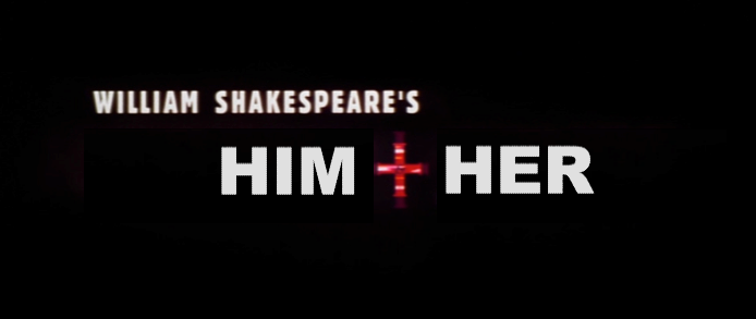
Thank you Keith. I try to practice what I preach. In this case I’m particularly fond of my ‘Him + Her’ image because I think it conveys the essence of that section at a glance.
I completely agree about using the headings as an outline. It’s just a good way to organize the content. Heck, sometimes you realize you don’t have a lot to say or you find an area that you need to explore more before publishing.
The writing is still a huge pleasure. (I’m a frustrated fiction writer.) That said, I spend a very large amount of time hunting and assembling just the right images and reference material.
Juanita // August 14th 2012
This post is EXACTLY what I was looking for!! The place I work for is all content, but with several of our writers coming from traditional print backgrounds it’s hard to push some of these readability principles on then. This makes the point I wanted to make and more. Thanks!
AJ Kohn // August 14th 2012
Glad I could help Juanita. I usually point out to writers that the goal isn’t to take the fun or importance out of their writing, it’s just making sure that their message is read by the most (and right) people.
Bob Gladstein // August 14th 2012
My eyes are rapidly aging these days, and I find that I have to bump up the font size on pages (which often breaks them — people don’t think about that when they design their layout) or use the Readability bookmarklet a lot more often than I used to. I’ve never had to do either of those things on your site, and it’s always been clear that that’s no happy accident. You clearly had readability in mind when you developed this look for the site.
This is more an observation than a criticism, but I noticed that even though you’ve had this look for quite a while, you still use inline style definitions to markup your posts rather than just letting the style sheet handle them. For example, here’s the code for a highlighted line followed by a subheading (tags replaced by brackets to keep WP from treating them as markup):
[p][span style=”background-color: #ffff00;”][strong]It’s not only your job to write well, but write in a way that is accessible.[/strong][/span][/p]
[p style=”font-size: 24px;”][strong>Crush Pronouns[/strong][/p]
I’m just curious about why you choose to do it that way. When I used to use WP I didn’t trust that the friendly user interface would generate the kind of markup I wanted, so I just typed HTML directly into it myself. You’re using h1 for the site’s title, h2 for the post title, and h4 for headings in the right rail and comment form. You could just edit your CSS to format h3 (which you don’t appear to be using anywhere now) as bold 24px and create a span class for the highlighted backgrounds.
Ryan Ireland // August 14th 2012
Any thoughts on reading difficulty? Any studies done on it that you know of?
I try to shoot for a Flesch-Kincaid scoring around the 7th-8th grade level before I publish something, mainly because I got the advice from a colleague with a ton of experience in direct mail & email marketing.
AJ Kohn // August 14th 2012
Ryan,
I was kind of shocked at the rudimentary nature of many of the reading difficulty tests. That’s not to say they’re not valid but it’s pretty straight forward. Shorter sentences, shorter words, shorter paragraphs. Brevity and focus.
In the end, it really depends on the audience you’re targeting and whether you’re writing for a mass audience (keep difficulty low) or a niche audience (difficulty can increase). As a rule, I would optimize for easier difficulty levels. Make the content as accessible as possible without it turning bland.
James King // August 14th 2012
I ONLY wanted to scan this post, but the way you structured it, I was forced to read it from beginning to end.
Awesome, awesome, awesome post. Most of the time, I’d never read a post that was THIS long. But you obviously know what you’re doing.
The best quote I’ve read in a while is: “It’s not only your job to write well, but write in a way that is accessible.”
This post was well structured, well organized, and simply easy to swallow. You are a craftsman (and my new hero.) Give me more!
AJ Kohn // August 15th 2012
Wow. Well thank you very much James. I appreciate the kind words and hope that I can continue to provide helpful and valuable content.
Hannah Law // August 15th 2012
Great read … or should I say scan 😉
Matt Stephenson // August 16th 2012
Another great article that illustrates a facet of creating quality content that can be overlooked. I love the comment about readability being a form of marketing in and of itself, especially when viewing the concept in detail.
Often I spend what can seem (to my writers or partner) like way too much time finding incredible photos, tweaking titles and subtitles, playing with the formatting of photos (left adjust, right adjust, tweaking photo sizes back and forth, etc).
The intangibles of a blog article looking like a piece of art that tells a story are tremendously important. Especially when it’s the type of content that gets viewed consistently over time…I.e. it’s not a breaking news story but rather niche content, that will potentially show up in search for years to come.
Jason Amunwa // August 16th 2012
Thanks AJ, and great post!
I worked on the Hello Bar team before it was acquired by Crazy Egg. I agree that if the goal of the page is to get your content read, then absolutely you want to reduce clutter. We designed the Hello Bar to focus people’s attention, and drive them deeper into your website, and convert – whether that’s turning them into an email subscriber, Twitter follower, customer, whatever.
I think this is less a case of Hello Bars, or Greet Boxes, or any of these other elements being strictly clutter – more like they’re being applied inappropriately. When you want people to convert, use a Hello Bar; if you want people to read the content, don’t! =)
AJ Kohn // August 16th 2012
Thank you for the comment Jason.
I actually don’t mind Hello Bar for the most part and, in fact, a lot of those things I mention are fine tools. Because you clearly do want to have some call to action to let people know what to do next.
My point was really about when people use too many of them together. The first ‘call to action’ is to read your content but you need at least one (maybe two) other CTAs for the most part. So, sharing your content is one and potentially converting is another. But having multiple ways to convert plus ads, plus a myriad of buttons and a related content slider etc. is when it falls apart.
Less distraction, more focus. One of the things I’d actually like to try is to put a better subscribe call to action at the end of each post because I think that’s where it naturally belongs.
Sam // August 18th 2012
I totally agree with subheaders and short paragraphs. As a longtime print writer, I tend to want to write longer sentences, avoid subs, etc., but that kind of thing rarely works for web writing and reading. Unless your readers are expecting to read content that reads like a book, you’ve got to tailor your prose to quick, easy, reading.
Kimberley // August 20th 2012
Great article. I would say however that your title is misleading as it’s not just about how you present words on a page. On the contrary what you say is very important (and this ties into readability and search). Presentation and content go hand in hand.
🙂
Mackenzie Fogelson // August 20th 2012
Thanks for the great read and reference AJ. I’ve passed it on to the designer and content writer on our team. I especially resonated with this snippet:
“But what stuck with me most was the idea that the last sentence in a paragraph should be linked to the first sentence in the next paragraph. There was order and logic to how you constructed a paper or essay.”
In my English teaching days I remember helping my students a lot with focus. This was easiest to do when they had a finished draft that they could go back and analyze. Even today with my team, when they are finished writing a post, I encourage them to analyze each paragraph/set of paragraphs and determine what their goals are. If they can’t answer that question, then certainly their readers will be disappointed.
I like the idea of tying the last sentence back to the first sentence, and even more, looking at the piece as a whole and determining if those paragraphs are helping the author meet the goals that they have set out to accomplish with the entire piece.
Simon // August 21st 2012
Thank you for your write up great post as per usual, I don’t usually comment, but think the way you write appeals to many.
Like many things the simple things are the easiest and most effective | Less is more…
kevin // August 23rd 2012
Great read, hate to be that guy, just noticed this line needs to be reworked, ” had to read our that sentence out”. If it were me, I would want someone to allow me to fix it.
Ted Goas // August 23rd 2012
Disclaimer: I’m a designer.
Hi AJ, you raise some great points (using a font hierarchy, setting line-height) and some questionable ones (users don’t read as much as they scan), so I won’t go into each point.
As far as practicing one’s own advice, I chose to send this article to Readability to read it, ironic no? I also think the TL;DR might have been better served at the beginning, given the length of the body text (subheads and all).
I don’t mean to troll, so I’m sorry if I came off like a jerk. Thank you for talking about this kind of design stuff in less-than-design-centric arena like this. Good stuff!
Nadeem Khan // August 23rd 2012
Very helpful tips. I would like to add that you should also FULL ALIGN the text and you should fix the size of the images which you will use in any post. This really improves readability !
Bill Gassett // August 23rd 2012
I enjoyed the article and agree with a lot of your points. I like small paragraphs myself and think that the size of the sub heading as well as the font are critical elements in keeping someones interest in the article.
Hector // August 24th 2012
Its funny as to how many times we just ignore this aspect of promoting our website and contiue directing our energy towards off page factors which do not matter as much in the longer run. Given the changes that Google is actually making to their search algorithm, these tips are worth their weight in Gold.
Waqas Ali // August 24th 2012
Hi AJ,
This article is included in The Moz Top 10, and now I know why.
Thank you for bringing such important points to our attention. Actually we are already experiencing the fruit of clean, easy to read website.
When we were / are working on the website, we always make sure that User must love it, and secondly Search Engine should know that Users love this white.
Though you’ve covered most, I would add my quick tips regarding an easy to read website:
– URL should be quick and easy to understand (they’ll more likely be shared this way)
– Don’t attack the reader with Subscribe / Like us, but make sure it is easy to fine, people will more likely to be engage with your pages if they do it intentionally.
– Don’t let a page do more than 3 things. Read, Share, Subscribe [don’t go for affiliate, webinar, event and other stuff] Just focus on your ONE thing.
– If you would write it in a clear manner, even if your content is not absolutely unique. Reader will think, it is unique, because it is given in such a clutter free form unlike others. You win.
Derek Booth // August 24th 2012
great article. too many people think h1 and h2 tags are an SEO ‘trick’.
forget google and produce for the reader / user.
nice one.
Craig // August 24th 2012
What a great post, one NOT to scan, will defo share within my network for all to read. Great work!
Peter // August 24th 2012
Common sense really, but these are often missed cues that get left out or forgotten about. Good to reiterate again. Cheers guys. 🙂
Parker // August 24th 2012
Great post, read every word of it. I think the point you bring up about the web becoming more visual is SO true… people like pictures and not words.
Brett Vernon // August 24th 2012
This was a great post. Anyone who pushes content to the web should read this.
Lewis LaLanne // August 24th 2012
Hey AJ,
I love the way you use images to break up the text in this piece.
I’ve had a few pieces I wrote and went heavy duty on the pics to bring points home or make jokes and I thought it was awesome. And I believe the reader enjoys this more as well.
But then I came to find that the gods that load websites don’t let your site load quickly if you’ve got images that are too rich in pixels. We found that when working to reduce our load time that just one image to a post was slowing us WAY down. I know of a couple sites that optimize images but about 99% of them can’t reduce the images I want reduced because they’re too big.
I know if you use Adobe Photoshop, you’ve got a lot of room to modify. My business partner knows what the hells he’s doing with that program but I don’t. Is that what you use? If not, I’d appreciate if you could direct me to any ninja resources you know of that help you optimize your images.
Bas // August 25th 2012
Hi.. Just found out how someone just translated this post to Dutch and published it on a fairly known blog. Without mentioning you as source. It’s a shame! http://www.zoekmachine-marketing-blog.com/20373/het-belang-van-leesbaarheid-voor-seo.html
Skyler Malley // August 25th 2012
Fabulous article. Readability is key when trying to create quality, linkable content. By follow rules likes this will certainly help visitors use and understand the content.
Joseph Caldwell // August 25th 2012
good article. Writing with good readability can be difficult at times, especially if writing a blog doesn’t come second nature. I also don’t understand why people wouldn’t use pictures. Pictures give a reader an idea into what the article is about.
David // August 26th 2012
great post on the readability part of article quality. There is a free online tool (http://the-article-checker.com/) which checks readability scores such as Flesch Kincaid and others. There is also a section about Skimmability of a Web page which uses many of the metrics you mention in the article, like paragraph length. Line height is an interesting one but I guess the tool does not read the css and can’t judge that yet.
Alain // August 26th 2012
I am keeping this and I will probably read it a few times. Thank you. People continue outdoing themselves putting out one amazing content after the other one. One day, I hope to contribute with some amazing content of my own.
Allie Williams // August 27th 2012
Excellent post AJ! I’m writing specs for a client’s new site, and I’ve been musing over several questions regarding sizes, fonts, spacing, etc…and you’ve answered most of them in one fell swoop! Thanks for including lots of links to reference material too – very helpful. I’m passing this onto my designer friends too.
Thanks!
Emma // August 29th 2012
This is an awesome post – readability is something I’m HORRIBLE at. I look at my old posts and think “uhhh I’d not even skim that” so this is something I’m slowly learning!
Peter // August 30th 2012
Great post.
Using the golden ratio for typography is so obvious, but I hadn’t considered it. I usually use 1.5em for line height. I love the Golden Ratio Typography calculator (http://www.pearsonified.com/typography/), will be using that on my next project (and maybe with some A/B testing on existing ones).
Martin // August 30th 2012
Thanks for the post. Give’s me a lot to think about my sites, and recent changes we’ve made. Changing fonts, line height, etc will certainly make it easier to read. Thanks!
HungryPiranha // September 04th 2012
Excellent post AJ!
I started scanning, but realized it needed to be read in full, which is obviously the point of good readability.
I’ve been resistant to using short paragraphs for a long time, as it’s not in my nature! But I’ve recently come around to thinking at least the first few paragraphs should be short. Those who want to scan can start scanning and hopefully get hooked, going more in depth as they progress.
Your post has cemented that idea…so now it’s time for a lot of re-working!
Rahul // September 04th 2012
Awesome post. Really helps me a lot.
Thanks AJ – You are the Man !
Anthony F. Coleman // September 06th 2012
First off, brilliant blog post. I have never once actually scanned (it was a slow but constant scroll) a blog post this long and got the message. Second, there is something inherently ironic about the the TL;DR part of this post considering how massive it is, but I digress.
While, I know the focus of this blog post was about readability and seo, I couldn’t help but thinking how the factors you outlined would help the ppc advertisers with their conversion funnel. While things like headline, short paragraphs, and contrast are obvious, things like pronouns, line height, and accessibility aren’t things most designers think about when creating landing pages. There is usually a focus on short, yet visually pleasing designing – which my boss absolutely hates. Obviously having links in the paragraphs might not be optimal for the goal funnel, it could easily be used to push new visitors further into the site and ultimately eliminating high bounce rates that minimal landing pages seem to suffer from. In fact, I think using all of these points as a blueprint for new ppc landing pages would help a lot of designers figure out how to get those clicks to conversions much easier. I feel a blog post coming along…
Again amazing job with this post and I am a huge fan.
SOZO // September 10th 2012
Hi AJ. Great article! I like your advice on the subheadings and font size – I noticed this on the blog post itself and it does help to provide a quick understanding of each section. I’ll consider this approach for my own articles.
Ari Braverman // September 12th 2012
Thank you so much for this post! I’m pretty new to SEO in general, and content readability is an essential part of what we do at Search Influence. I’m really struck by the intersection of quality, compelling writing and information and efficiency. I wonder how we can get these ideas to augment one another…
Jalpa Trivedi // November 27th 2012
This post is really very much helpful to me as a content writer. I surely need to focus on some of the points. Thanks a lot. 🙂
Bob Green // December 28th 2012
Thanks for the post. It is very focused and on target. I had gotten away from good landing page design (head, subhead, short paragraphs and bullet lists) and need to refocus. This post will help a lot.
Andre // August 29th 2013
Thank you very much! I’ll start applying those principles right away. Even my language (portuguese) being different and requiring a few different approaches, many of those things still applies!
Todd Blair // October 10th 2014
Oh yes!! I love how you laid this out. Had to have a VA that was skilled in blogging to make me see the light and now I am reading and researching all of this. I love your examples and how we naturally scanned even this article. Thanks for the tips, I learned some great new tactics.
Sorry, comments for this entry are closed at this time.
You can follow any responses to this entry via its RSS comments feed.